This case study focusses on analysis of evaluations conducted by Yorkshire Sculpture Park. It was put together by Claire Booth-Kurpnieks, Research and Analysis Assistant at Counting What Counts, and Eloise Bennett, Programme Assistant at Yorkshire Sculpture Park and member of British Art Network Emerging Curators Group 2022. Colleagues at both organisations have also inputted into the case study.For more information on the background of the development of this case study, please see our blogpost ‘Working with a Data Analyst’.
About Yorkshire Sculpture Park
Yorkshire Sculpture Park (YSP) is a leading international centre for modern and contemporary sculpture in West Yorkshire set across 500 acres. Alongside a changing collection of art outdoors, YSP mounts a year-round temporary exhibitions programme including some of the world’s leading artists across six indoor galleries.
YSP supports artists at vital stages in their careers and is rare in having the resources to offer artists space, time and support to think and to develop new ideas.
Since 1977, YSP has sought to ignite, nurture and sustain interest in and debate around contemporary art and sculpture, especially with those for whom art participation is not habitual or familiar. It enables open access to art, situations and ideas, and continues to re-evaluate and expand the approach to art’s role and relevance in society.
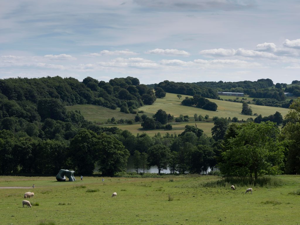 Image 1 Henry Moore, Two Large Forms (1966-9) courtesy of the Henry Moore Foundation, on display at Yorkshire Sculpture Park. Image credit: Jonty Wilde
Our approach to the case study
YSP has used the Impact & Insight Toolkit (Toolkit) to carry out evaluations that adhere to the requirements set by Arts Council England (ACE) during the 2019-23 funding period. Our approach to the case study was to group together all evaluations that YSP had carried out and analyse them as a group, and, where appropriate, contextualise the evaluation results by comparing them to results from similar organisations.
Three different analyses and reports were created, each dealing with a different aspect of the data that had been collected. These reports were sent to the Programme team at the Yorkshire Sculpture Park where they were discussed by team members. Feedback was given to Counting What Counts on the reports along with a more in-depth conversation about their use of the Toolkit to date and the impact that this additional analysis might have on their use of the Toolkit going forward.
These reports are:
- The ‘Three words report’. This report utilised data from the commonly used question asking survey respondents to describe their experience in three words.
- The ‘Visitor location report’. This report used the postcode data provided by survey respondents to map visitor location and consider whether visitor location or distance travelled influenced dimension scores.
- The ‘Alignment report’. This report considers the alignment between ‘self-assessors’, ‘peer reviewers’ and ‘public’ dimension scores.
We know that this case study is rather lengthy, so we have divided it into two sections:
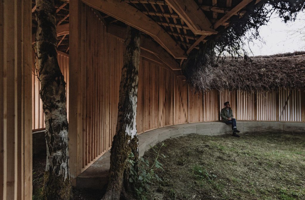 Image 2 Heather Peak and Ivan Morison, Silence Alone in a World of Wounds (2021) at Yorkshire Sculpture Park. Image credit Charles Emerson
1. Thoughts on the analysis and Toolkit in general – Q&A
How has YSP been using the Toolkit so far?
Prior to working on this case study together, YSP had been using the Toolkit to fulfil our mandatory reporting requirements, but not to go beyond this. Colleagues had pointed out that if we spent more time exploring and using the Toolkit that we could gain further insights into our audiences and their responses to exhibitions and events. However, there was a lack of confidence around utilising the Toolkit in this way.
What have been the challenges of using the Toolkit?
The challenges have been: going beyond the core dimensions and mandatory requirements in our surveys; knowing how best to utilise the tools on offer; building in proper time in each exhibition cycle to carefully build the survey, invite peers, encourage responses and examine the results.
What have been the benefits of using the Toolkit?
The benefits have been: a direct opportunity to hear from our audiences; an opportunity to reflect on and celebrate our successes; to gather feedback and ensure changes are made, based on results and comments, across departments at YSP.
How has the additional analysis provided in the reports changed your use or understanding of the Toolkit?
As a team, we are changing the way we approach evaluation in response to our experience producing this case study. We have started to develop surveys beyond the core dimensions, to fully utilise the options available, and to tailor our surveys to the aims of our projects. As a team, we have discussed how different projects might score highly in some areas, but other dimensions will not be relevant. We are moving away from the assumption that ‘high scores’ on surveys equates straightforwardly to success and are looking more closely at answers we receive and potential reasoning behind this.
This process has helped to clarify project aims from the outset, and how we might build these into our survey activity. Together with other teams we are committed to making changes, problem-solving and collaborating to address any issues identified in our audience responses.
We have specifically examined the way in which we nominate and invite peers: who ‘counts’ as a peer, and whose expertise is valued. In the future, we are looking to expand our definition of ‘peer’, to value a much broader range of knowledge and skills, and internally to invite members of staff from across departments to act as reviewers.
Has the deeper analysis we have provided encouraged you to put more time and energy into engaging with the data?
The deeper analysis provided by Counting What Counts (explore this further down the case study!) has definitely encouraged us to put greater time, energy and resources into all stages of the survey process. From survey design, to capturing audience responses, through to spending more time examining and considering the implications of the data we gather. Whilst we do not independently have the expertise to conduct the same in-depth analysis on future datasets, we are more closely looking at the tools we do have.
We are now aware of the support provided in videos, articles, and on a one-to-one basis by Counting What Counts, and will need to utilise this to a greater extent in future, as we explore the possibilities of the Toolkit and develop our approach to its use.
What is the one message you want to leave the readers with?
It is vastly rewarding to engage with the Toolkit, and the data you collect, beyond the mandatory reporting requirements. Ensure you are setting aside time, energy and resources to engage with this – it [the Toolkit] is a direct link to your audiences and can tell you so much about how your projects are being received.
2. Detail and reflections on the reports
Three words report
The request, ‘Please write three words to describe your experience’ is commonly used in Toolkit surveys. It is recommended to be used in surveys as it is non-directive and can give useful context with which to interpret quantitative results.
The simplest way of analysing the answers to the three words question is counting the frequency of each word used. However, when doing this, we see a proliferation of words like ‘interesting’ and ‘entertaining’, which don’t really tell us much about the specific experience of one work or exhibition in comparison to another.
We also find that, despite respondents being asked to give only three-word answers to this question, they often use it as an opportunity to give lengthier comments about their experiences. Whilst there is potentially a lot of useful insight in these comments, it is much harder to access this insight without a lot of manual work.
In this piece of analysis, we used machine learning techniques to first clean the answers to the question (removing filler words in longer comments) and then to calculate word importance for each word rather than frequency. A high word importance measure means that the word was used a lot for a particular evaluation but was not used as often or at all to describe other evaluations.
This returned some interesting results. For some exhibitions, these reflected the themes and interpretation of the exhibition, for example ‘craft’ and ‘feminism’ for Joana Vasconcelos’s exhibition Beyond. Whereas others focussed more on the visual impact, sensory qualities, and materiality of the exhibitions. The words that were important for the open-air collection referred more to the Yorkshire Sculpture Park as a place and the experience of being outdoors e.g., ‘invigorating’, ‘uplifting’, ‘refreshing’. This is useful because these aspects of the works are not captured through the Core dimension statements.
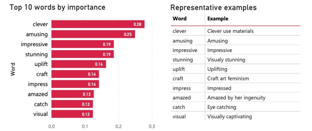 Figure 1 Important words from the ‘three words’ question for the Joana Vasconcelos ‘Beyond’ exhibition.
YSP reflections on the ‘Three words report’
A number of these results resonated closely with our exhibition aims; for example, the Joana Vasconcelos report drew out a focus on materials, an emphasis on visual impact, and recurrence of ‘craft’, ‘feminist’ or ‘feminism’ which were all important to the concept, development and presentation of this show.
Reflecting further, we wondered if there might be a relationship between language used in wall texts, labels, promotional materials or the exhibition guide and these three word responses. It would be great to look further into this and is a great reminder of the importance of language, accessible writing and word choice for the Curatorial, Learning and Marketing teams here.
Some of these responses speak of specific experiences in our exhibitions. For Holly Hendry, many of the responses focus on sound and movement, emphasising the multidimensional and sensory experience of the exhibition, which was not fully captured using other metrics, and was a particular focus for showing this experimental, contemporary work.
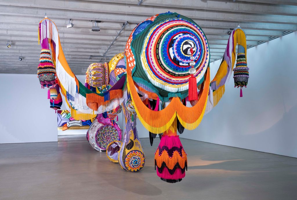 Image 3 Joana Vasconcelos, Valkyrie Marina Rinaldi (2014) on display at Yorkshire Sculpture Park. Image credit Jonty Wilde
Visitor location report
This report focussed on visitor location, utilising the postcode data that is achieved through asking the question ‘What is your postcode?’ to survey respondents.
This data is currently underutilised in our analysis so we wanted to explore a bit further what we could do with it. In doing so, we could analyse:
- which local authority respondents had come from
- whether respondents were visiting from an urban or rural postcode
- how far respondents had travelled
- whether the location of a respondent had any effect on the dimension scores
The analysis did not bring up anything particularly surprising. It demonstrated a strong regional audience, as well as a more distributed national one. Some areas had higher levels of engagement than others, or at least people from those areas were filling in the surveys more frequently than others. It indicated that YSP had a different make up of ‘rural’ or ‘urban’ audiences to other rurally-based organisations within the dataset, with a higher proportion of their visitors coming from towns and cities than rural postcodes compared to other rural organisations. Nevertheless, visitor location had very little effect on the dimension scores; that it would is an assumption that we intend to explore further through the aggregate dataset.
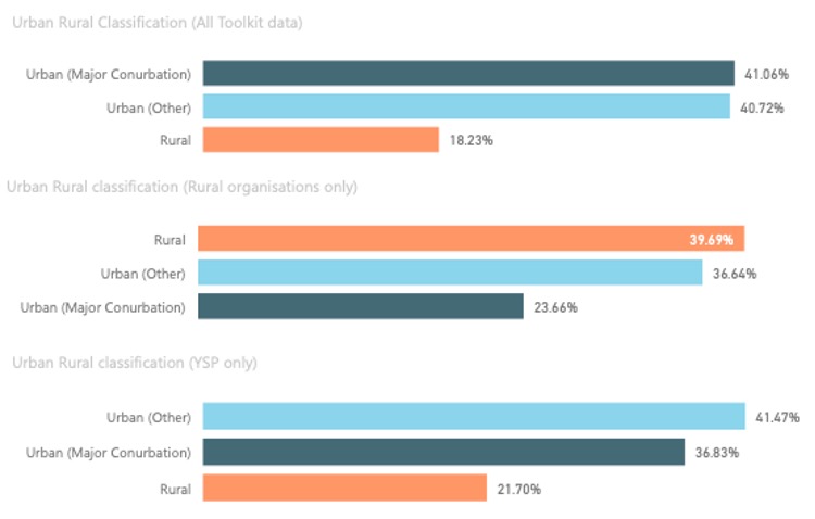 Figure 2 Bar chart showing percentage of survey respondents from urban or rural postcodes from YSP compared to other rural organisations, and all Toolkit data.
YSP reflections on the ‘Visitor location report’
These findings map on to our intentions to serve both rural and local communities, visitors from the UK, and operate as an international centre for sculpture.
Compared to all National Portfolio Organisations (NPOs), YSP has a slightly more rural audience, but YSP has a higher percentage of respondents from Urban (Major) areas than other comparable rural NPOs. This finding has interesting implications for the way in which YSP views itself as a rural arts organisation, and the communities and localities we serve. With our Founding Director Sir Peter Murray CBE having recently retired, and Clare Lilley appointed as Director from March 2022, it is a pertinent time to reflect on our place within our local communities and the wider ecology of UK arts organisations.
 Image 4 Holly Hendry, Slacker, 2019. Courtesy the artist and Yorkshire Sculpture Park. Photo © Mark Reeves
Alignment report
The alignment report focussed on the Core ACE dimensions that YSP and other band 2 and 3 NPOs have been using consistently to evaluate their exhibition programme. When we say ‘alignment’, we mean how similar are the answers of those who experienced the work – the peer reviewers, public, and self-assessor post event survey – to the expectations for the work as described by the self-assessor prior survey.
For this report, we used the aggregate dataset to contextualise YSP’s results. We took the dimension averages from their evaluations and compared these to the averages from other NPOs within the ‘Visual Arts’ category. This gave us a context in which to interpret their results, answering the question: are these dimensions results high or low compared to other visual arts organisations? Once we had this context, we could compare the results to the expectations to get a sense for whether each dimension was experienced as intended.
From our perspective, a dimension score or its alignment is not inherently good or bad. The interpretation of these scores is dependent on their context within an overall programme of an organisation, or within a particular artistic field. This can open up a discussion about whether the creative intentions of the exhibitions were met, or whether a work was experienced in the way it was intended.
This was interesting for YSP because while, in general, the self-assessor and peer reviewer were very aligned, the alignment of the self-assessor with the public was much more varied.
However, there is a bigger question here and that is whether alignment between the self-assessor and public scores should be the goal for all evaluation activity. This depends on the intention of the work and its place within the overall programme. A difference between expectations and public experience might indicate that a programmed work was particularly ambitious, and the audience may not have been ready for it, for example.
Many of YSP’s exhibitions were placed above the Upper Mid Quartile for Distinctiveness (statement: “It was different from things I’ve experienced before”) by public respondents. This makes sense considering that YSP has aimed for many decades to ‘nurture and sustain interest in and debate around contemporary art and sculpture, especially with those for whom art participation is not habitual or familiar’. Taking a longitudinal perspective on this data may comment on the way in which YSP is growing the capacity of their audiences for new and challenging experiences. It may be useful in future evaluations to collect additional data on whether the respondent is a first time or repeat visitor.
YSP reflections on the ‘Alignment Report’
This report found that self and peer responses are well-aligned, but that there is greater variation among audience responses. In light of this, we wanted to consider how we might refine and broaden our self-assessment, and how ourselves and our peers might align or differ from our visitors. As a team, we started to consider the meaning of ‘peer’ – who gets to be a peer, and what power do they hold. We checked the Counting What Counts guidelines on this, and, as a result, we would be really interested to start to invite a wider pool of peers, potentially those who are more representative of our range of visitors, in order to receive their feedback.
For our self-evaluations, we would like to have more staff members complete the evaluations, not only the exhibition lead, and ideally staff members drawn from several teams at YSP. We had an interesting discussion about how difficult it can be to be ‘objective’ about an exhibition’s aims and achievements after working closely with an artist, often over a lengthy period of time, believing strongly in the value of an exhibition or event, and doing the work to execute it. We discussed how exhibitions need not score ‘highly’ across all categories, and that there is value in work beyond the core dimensions assessed in our surveys.
 Image 5 Henry Moore Three Piece Reclining Figure No 1 1961-2. Image credit Jonty Wilde
Thanks to Eloise and the team at YSP for their valued contribution!
Featured image credit: Jonty Wilde