1. Introduction
The Analytics Dashboard allows you to explore charts of your evaluation results, updated in real-time, which are displayed in the dashboard and can be downloaded. You can change the settings of different charts, as well as make comparisons between certain factors, such as some demographic information, surveys and assessor-type.
2. Access the Analytics dashboard
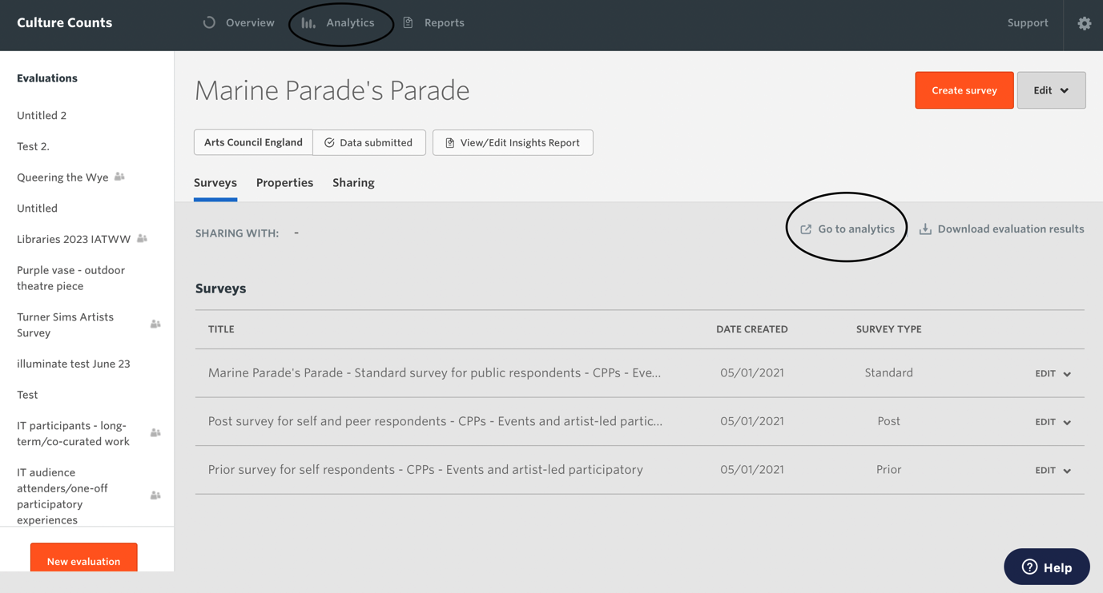
Access the Analytics dashboard by clicking the ‘Analytics’ button on the Culture Counts home page.
You can also access the Analytics dashboard on the main evaluation page by clicking ‘Go to analytics’.
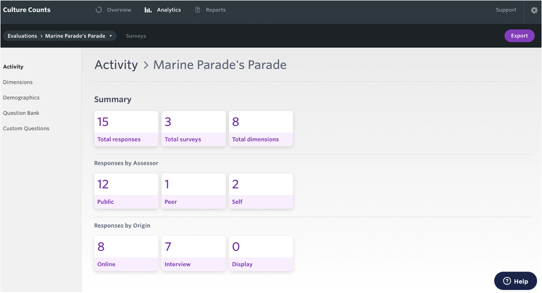
You can view activity and charts for the whole evaluation or by individual surveys.
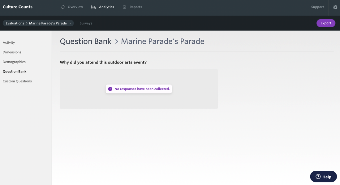
(Please know that data presented here is in relation to a fictitious event, Marine Parade’s Parade, and all data is erroneous.)
3. View your results
3.1. Categories
There are five question categories from which you can view charts of your results:
- Activity – provides a quick overview of your data with a live summary of response counts, surveys and dimensions.
- Dimensions – view dimension results and statistics, including margin of error.
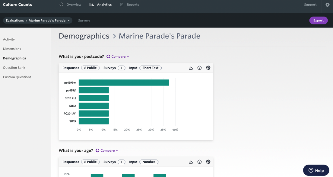
- Demographics – common inbuilt demographic questions from the Demographic category of the Question Bank.
- Question Bank – results from the library of standardised questions.
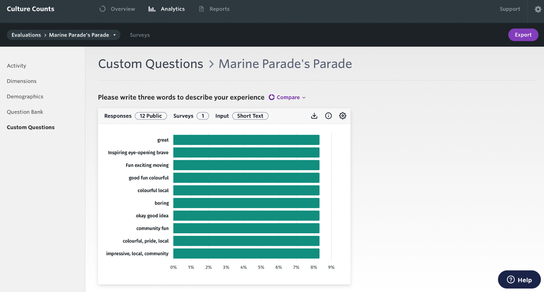
- Custom Questions – results from your own custom questions.
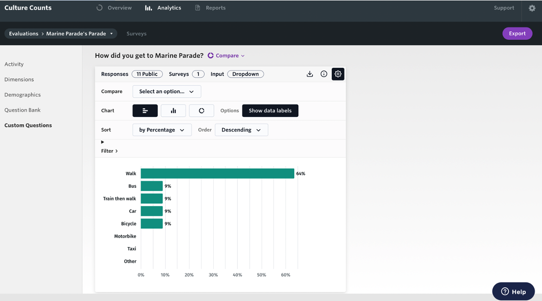
3.2. Chart settings
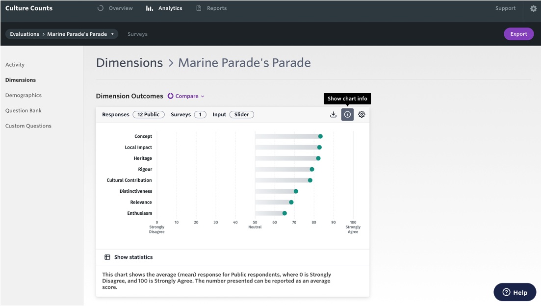
View information about each chart by clicking on the ‘Show chart info’ icon and a description of the chart will appear underneath it.
Alter chart settings by clicking on the ‘Show chart settings’ icon.
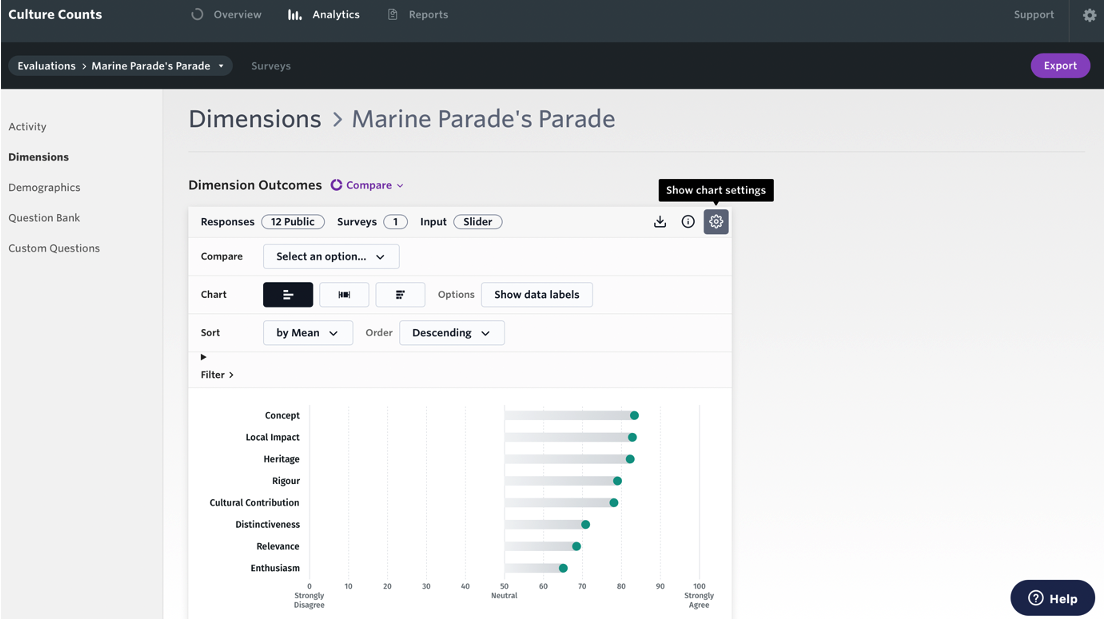
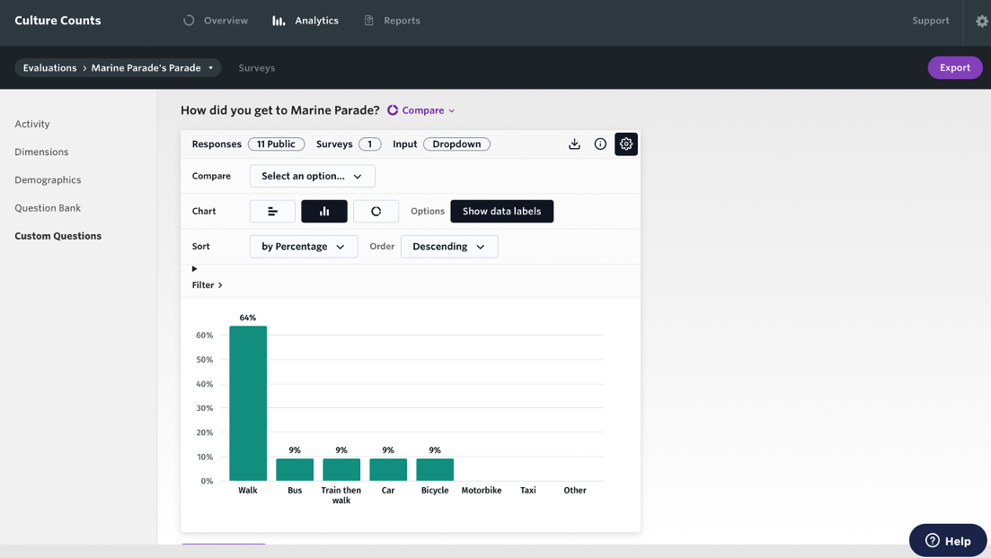
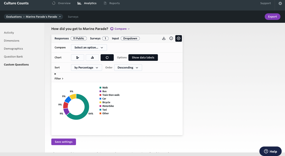
Depending on the type of question, you can then:
- Compare
- Change the chart type
- Sort the order
- Filter responses
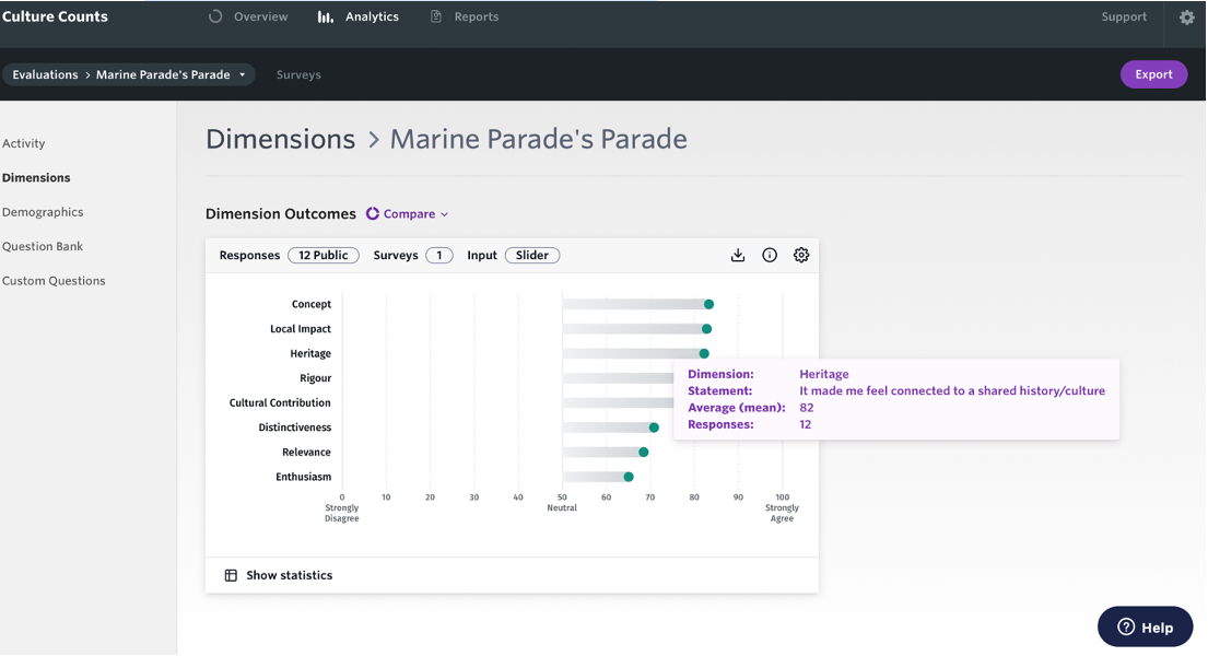
Hover your cursor over chart results to view additional information.
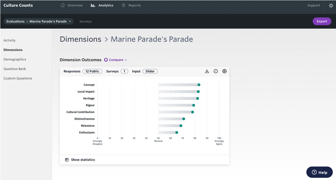
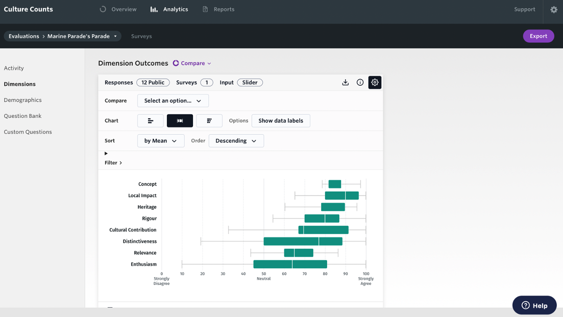
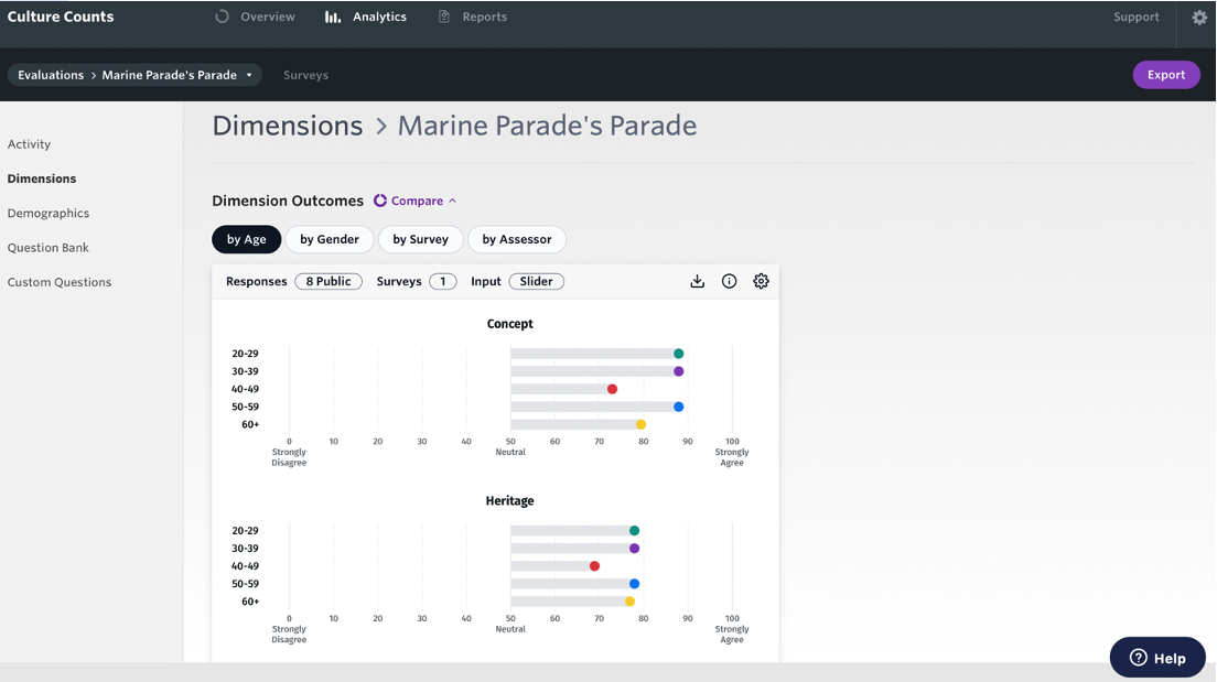
3.3. Dimensions
You can view Dimensions charts by:
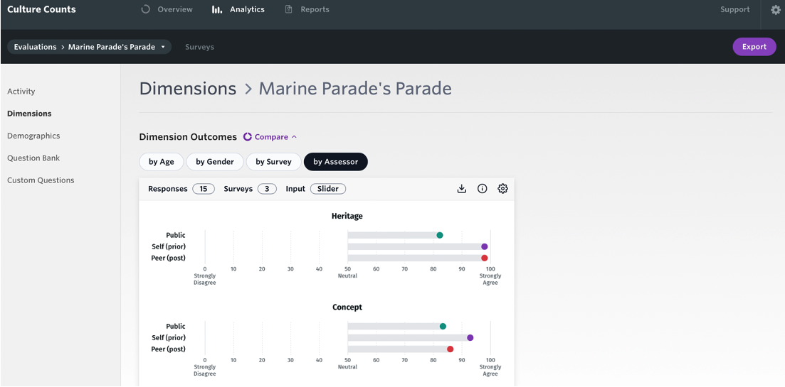
- Average – this chart shows the average (mean) score of all responses. The number presented can be reported as an average score. Hover over each bar for a more detailed breakdown of results.
- Median and interquartile – this chart is a box and whisker plot. The vertical line shows the median public score. The bar shows the interquartile range. Quartiles tell us about the spread of a data set by breaking the data set into quarters. The top 25% of responses lie in the upper quartile and the bottom 25% of responses lie in the lower quartile. Interquartile range is a measure of spread. It is defined as the difference between the upper and lower quartiles, or, the range in which the middle 50% of responses lies. Hover over each bar for a more detailed breakdown of results. You can read more about box and whisker plots here.
- Stacked level of agreement – this chart breaks all the responses up into five sections: ‘Strongly disagree’, ‘Disagree’, ‘Neutral’, ‘Agree’ and ‘Strongly agree’. It shows the % of public responses which fall within a given range. Each range is represented by the different bars. Hover over each section for a more detailed breakdown of results.
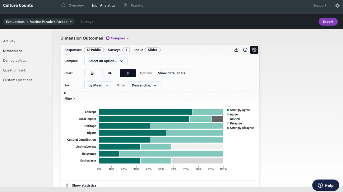
You can sort the results by mean or dimension name and view them in ascending or descending order.
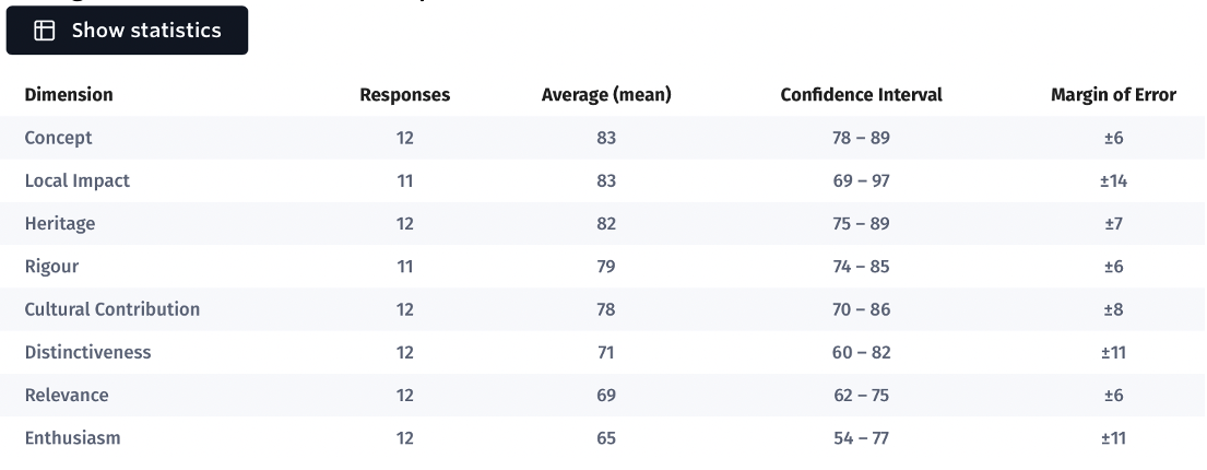
You also have the option to view statistics for each chart such as the margin of error and confidence interval.
Margin of error represents how confident we are in our reporting of each dimension, based on the number of responses received. It shows how close we think the average public scores is to the ‘true’ average score of all audience members or visitors who experienced the work. The lower the margin of error, the more likely it is that the result is reflective of the total audience. A margin of error of 2% means that if you were to survey your entire audience, the resulting score would likely be within 2% above or below the reported score.
A confidence interval represents where we would expect the mean average dimension result to fall, if all your audience members, visitors or participants had completed the survey. The smaller the confidence interval, the more likely it is that the current mean average result is reflective of all your audience.
3.4. Other questions
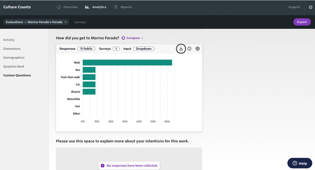
You can view charts for Question Bank and Custom questions as a:
All charts show a percentage breakdown of results, and you can hover over them for a more detailed breakdown.
Short text responses can be viewed as bar or column charts.
You can sort the order of responses by choice order or percentage and view them in ascending or descending order. Free text responses can be ordered by length or sentiment.
4. Compare your results
To compare results, click the purple ‘Compare’ button above the results you want to compare. By opting to ‘Compare’ within a chart, you can select what you want to compare by. You can compare by: age, gender, survey and assessor. Please know that the options you’re presented with for comparison will be dictated by which questions were asked in your evaluation, and in which format.
If you have asked a question across multiple surveys, then you will have the option to compare by survey. For example, a touring production might have multiple public surveys in an evaluation, one for each venue and the results from each can be compared side by side in a chart.
Below are two examples, one where age is used as the comparison; one where the assessor type is used as a comparison.
Age:
Assessor:
5. Download your charts
Charts can be downloaded individually as a PNG file or together as a PDF, ZIP or CSV.
To download an individual chart, click the ‘Download chart’ icon in the top right-hand corner of the chart you want to download.
To download all the charts, click on the ‘Export’ button at the top right-hand section of the page and you will have the option to: Download all charts (PDF), Download all charts (ZIP) or to Export Raw Data (CSV).

6. Summary
There are many options to explore within the Analytics dashboard. Furthermore, there will likely be developments to come within the dashboard. We encourage you to spend time learning how best to utilise the Analytics dashboard to support you in demonstrating how you are meeting the Ambition and Quality Investment Principle.
Consider:
- Which charts will be most useful for board members and staff to learn from
- What you can learn from the charts
- How you will use the data to fuel decision making within the organisation