We are pleased to announce that we have published a dataset of updated benchmarks for the Impact & Insight Toolkit dimensions on our website! This blogpost is about the benchmarks and why you might want to explore them as you consider results to your dimension questions. Watch our video for a ‘top level’ overview of the Benchmarks Dataset.
The blogpost addresses three key questions:
- What are benchmarks and why do they matter?
- What do the benchmarks released in August 2024 cover?
- How does this impact the reporting options available?
The blogpost then delves further into detail. There are four additional sections we would like to bring to you:
- What you can expect to see in the benchmarks
- Key statistical concepts utilised
- Practical fictitious examples
- Further opportunities for insight
What are benchmarks and why do they matter?
Benchmarks in the context of the Impact & Insight Toolkit are reference points or standards against which your evaluation results can be compared. They are based on data collected from various evaluations across different artforms.
The benchmarks are not goals, but tools for understanding your results. They help you see where your work stands in the broader context of the arts and cultural sector. By comparing your scores to these benchmarks, you can gain insights into the impact and reception of your work, guiding you in making informed, data-driven decisions.
What do the benchmarks released in August 2024 cover?
The benchmarks available in the dataset are for a range of different evaluation properties, such as: broad artforms, specific artforms, event types and evaluation years. This means that you can find a benchmark from evaluations which bear similarities to the work you are evaluating; if you choose to do so, you can use the benchmark to compare against.
If you review the benchmarks, you will notice that not every dimension has benchmarks for every available property. This is because we need evaluations to be tagged with properties before its data can be included in those benchmarks. If you aren’t doing it already, we’d encourage you to add properties [1] to your evaluations which will help improve the coverage of the available benchmarks. It need only take a couple of minutes and yet the consequences of doing so can be incredibly valuable.
How does this impact the reporting options available?
The Impact & Insight Toolkit Reporting Dashboard makes use of benchmarks to analyse and interpret your data. These benchmarks offer another layer of information for you to consider when reflecting upon your evaluation results and should be considered ‘one piece of the puzzle’ as you look to understand how your work impacted those that experienced it.
The Reporting Dashboard provides an excellent method through which you can consider whether (or to what extent) your organisation’s ambitions are being reflected in the work you deliver. It does this by, amongst other things, presenting your: dimension selection, results to these dimensions, and the benchmarks.
We are pleased to inform you that the benchmarks the Reporting Dashboard uses have been updated to make use of the ‘All Evaluations’ benchmarks from the newly published benchmark dataset set. The more specific benchmarks are not currently included in the Reporting Dashboard. However, these will be integrated into a future update, allowing you to select the benchmarks you wish to compare against in the Reporting Dashboard. In the meantime, you can access the more specific benchmarks via the dataset. For support on navigating the dataset, please see the video.
Finally, we’d like to remind you that any reports you create using the Toolkit do not automatically get sent to Arts Council England, and neither do your identifiable evaluation results. Your use of the Impact & Insight Toolkit is to obtain measurable feedback which can inform internal decisions and to nurture a culture of learning and development within your organisation.
So now that we understand what benchmarks are and why they should be considered, let’s look at the detail…
What you can expect to see in the benchmarks
Benchmarks are shown within a table which explains what the benchmarks relate to and how much data is included. Let’s address the columns shown within the table.
| Dimension | This is the name of the dimension which is being explored. |
| Statement | This is the statement displayed to survey respondents which they rate their agreement level to. |
| Domain and Outcome Area | These columns tell us which categories the dimension fits into, taken from the Dimensions Framework. |
| Evaluation Year | This tell us when the data we are looking at was collected in Culture Counts. |
| Property Type | This tells us the type of property that is being used as a ‘filter’ to select the surveys which contribute to the benchmark. |
| Property | This tells us which specific property has been used as a ‘filter’ to select the surveys which contribute to the benchmark. |
| n-surveys | This tells us how many surveys are contributing to the creation of the benchmark. |
| n-organisations | This tells us how many organisations are contributing to the creation of the benchmark. |
Having more surveys and organisations in a benchmark is generally better for two reasons:
- The benchmark is more likely to be a good representation of that type of work
- The margin of error will likely be smaller.
Now, to ensure understanding, let’s look at an example…
| Dimension | Captivation |
| Statement | It was absorbing and held my attention |
| Domain | Qualities |
| Outcome Area | Experience |
| Evaluation Year | All years |
| Property Type | Event Type |
| Property | Participatory |
| n-surveys | 88 |
| n-organisations | 59 |
This example shows information on a benchmark for the Captivation dimension, with the statement “It was absorbing and held my attention”.
Captivation sits within the ‘Qualities’ domain and the ‘Experience’ outcome area in the Dimensions Framework.
This benchmark considers data that has been collected across all evaluation years, since the first Toolkit project commenced in April 2019.
The property type which is being used as a filter is ‘event type’.
The specific property which is being used as a filter is ‘participatory’. This means that only evaluations which have been tagged as being participatory work will be considered in the benchmark.
This benchmark includes data from 88 surveys, from evaluations that have been carried out by 59 different organisations.
Having this context means that you can know whether the benchmark is relevant to your work and how much weight you want to give it.
Key statistical concepts utilised
We’ve looked at the basics about what a benchmark includes. The rest of the information in the dataset tells us numerical information about the benchmarks. For example, the statistics for the Captivation benchmark we looked at previously are shown below.
| Dimension | Mean | Margin of Error (+/-) | Lower Quartile | Median | Upper Quartile | Interquartile Range |
| Captivation | 0.832 | 0.018 | 0.787 | 0.845 | 0.894 | 0.107 |
To make sense of this numerical information, here is an explanation of some key statistical concepts:
- Mean: The mean is the average score. It’s calculated by adding all the individual scores together and then dividing by the number of scores. For example, if your scores for “It was an interesting idea” are 0.6, 0.7, 0.9, the mean would be (0.6 + 0.7 + 0.9) / 3 = 0.73.
- Margin of Error: This is a measure of the uncertainty around the mean score. It tells you how much the scores can be expected to vary. A smaller margin of error means more confidence in the accuracy of the mean score.
- Lower Quartile: The lower quartile, also known as the first quartile (Q1), represents the score below which 25% of the data falls. In simpler terms, it is the “cut-off” point for the lowest quarter of your data. If your score is at or below the lower quartile, it means your score is in the bottom 25% of all scores. Being in this range can indicate that there might be areas for improvement, as a significant portion of scores are higher than this.
- Median: The median is the middle score when all the scores are arranged in order. If you have scores of 0.6, 0.7, and 0.9, the median is 0.7. If there’s an even number of scores, the median is the average of the two middle numbers.
- Upper Quartile: The upper quartile, or the third quartile (Q3), represents the score below which 75% of the data falls. It is the “cut-off” point for the highest quarter of your data. If your score is at or above the upper quartile, it means your score is in the top 25% of all scores. Being in this range can indicate strong performance, as a significant portion of scores are lower than this.
- Interquartile Range: The Interquartile Range (IQR) measures the spread of the middle 50% of the scores. It’s the range between the first quartile (25th percentile) and the third quartile (75th percentile). It helps you understand the variability of the dimension results in the benchmark.
Practical Fictitious Examples
The numbers shown in the examples below are erroneous and are not accurate representations of the statistics for the dimensions stated. The examples are indicating the types of insights which can be gleaned using benchmarks. For accurate figures, please see the dataset.
Understanding Your Evaluation Results*
Example 1
You used the dimension statement “It reflected a broad and inclusive range of voices”, and you achieved a mean score of 0.50.
If the lower quartile (Q1) is 0.55, we can see that your score of 0.5 falls below the lower quartile, indicating it is among the lower 25% of the scores in this dimension. This can be a prompt to investigate why this score is lower than most others and to consider what aspects of the work might be developed, with an aim of increasing the score.
Example 2
You used the dimension statement “It was thought-provoking”, and you achieved a mean score of 0.74.
If the interquartile range for the benchmark is 0.65 to 0.75, then your score falls at the upper end, showing that your work is on the higher end of what is typically observed.
Example 3
You used the dimension statement “I had a good time”, and you achieved a mean score of 0.85.
If the upper quartile (Q3) is 0.80, your score of 0.85 falls above the upper quartile, indicating it is among the highest 25% of scores for this dimension. This suggests your work is particularly effective in prompting people to have a good time, compared to others.
Understanding the Experience of Different Artforms*
Consider the dimension statement “It helped me gain new insight or knowledge”.
Let’s say that the benchmark mean for evaluations with a broad artform of Music is 0.70 with a margin of error of ±0.05.
Let’s say that the benchmark mean for evaluations with a broad artform of Theatre is 0.80 with a margin of error of ±0.04.
Considering the margin of error, the ‘true’ average for this dimension for evaluations with a broad artform of Music would be somewhere between 0.65 and 0.75 [2].
Similarly, the ‘true’ average for this dimension for evaluations with a broad artform of Theatre would be somewhere between 0.76 and 0.84 [3].
As there is no overlapping between the ‘true’ averages, we can say that there is a statistically significant difference between Music and Theatre evaluations regarding this dimension. We can therefore say that respondents feel that works with the broad artform of Theatre help them gain more insight or knowledge than works with the broad artform of Music.
Further opportunities for insight
As well as helping us to interpret evaluation results, the benchmarks provide some insights into different artforms and what some interesting intentions might be for new works.
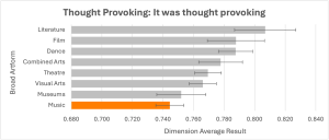
For example, evaluations that have been tagged as Music tend to achieve higher than average results for Rigour, but lower than average results for Thought Provoking. This is shown in the two charts below.
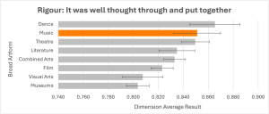
Having the knowledge demonstrated in the charts above, setting out to deliver a music event with the intention of making it highly thought provoking would be a fantastic example of being ambitious.
Then delivering a music event which achieves a high Thought Provoking result, despite the evidenced difficulty in doing so, would be a great example of delivering on ambitious creative intentions.
If you have any questions about maximising your use of these benchmarks, please get in touch via [email protected].
Take me to the benchmarks dataset!
*The numbers shown in these examples are erroneous and are not accurate representations of the statistics for these dimensions. The examples are indicating the type of insights which can be gleaned using benchmarks. For accurate figures, please see the dataset.
[1] Evaluation Guide: Adding Evaluation Properties
[2] The calculations for this are 0.70-0.05=0.65 and 0.70+0.05=0.75
[3] The calculations for this are 0.80-0.04=0.76 and 0.80+0.04=0.84.
Feature image credit – Christopher Burns on Unsplash