This blogpost accompanies the launch of the new Reporting Dashboard for the Impact & Insight Toolkit (Toolkit), released December 2024. The dashboard has been developed by Counting What Counts, specifically for the Toolkit project.
If you’re looking for details of how to access and use the dashboard, view the associated ‘Using the Reporting Dashboard 2.0’ guidance!
This is an update to a previous version which was launched in October 2023, and has been available since then to any organisation registered to the Toolkit project. If you would rather, watch our video ‘Introduction to the Reporting Dashboard 2.0’!
In this blogpost we talk about:
- Our rationale for providing a reporting dashboard
- Why we have made this update
- A reminder on what to use it for
Why provide a Reporting Dashboard?
The dimension questions are an integral feature of the Toolkit; they are used by cultural organisations to understand how their work is experienced. The use of dimensions helps an organisation to understand the extent to which they’re meeting their self-stated ambitions.
To do this well, it really helps if you can easily make comparisons between results from different surveys to add context – whether they are your own surveys or surveys from other organisations.
So, to help participants of the Toolkit project, we provide a dashboard allowing you to:
- See the dimension results of your evaluations next to each other in one place
- Compare your results to benchmarks which are compiled from surveys by other arts organisations
- Create simple reports, making it easier to share the insights within your organisation.
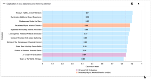
 Dimension result comparison chart from the Reporting Dashboard 2.0
Why have we made this update?
We have been providing a dashboard that offers benchmarking functionality for several years now, beginning with the Benchmarking Dashboard in 2021. That first version of the dashboard required you to enter your survey results manually, and only provided benchmark information for the Core Dimensions[1] from the previous Toolkit project.
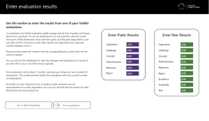
 The original Benchmarking Dashboard from 2021
When we launched the new Toolkit project in April 2023, we invested in a major upgrade to the dashboard we provide – resulting in the Reporting Dashboard (1.0). You could log in to the dashboard using your Culture Counts credentials, and this meant that we could show and benchmark your survey results without you having to enter them manually.
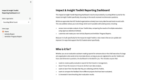
 Reporting Dashboard 1.0 home page
However, you couldn’t choose the benchmark you compared your results against, and the dashboard was quite slow to load. To address these and other issues, we decided to make another major update to the dashboard.
This time we thought that, since we were already making a major update, why not take the opportunity to include a few more things which would also be useful? So, in addition to the tools for comparing and benchmarking dimension results, we have also included tools for exploring the demographic makeup of the people who experience your work, when using the standardised questions, and for exporting data from Illuminate-compliant templates.
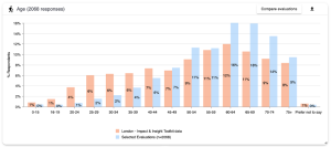
 Reporting Dashboard 2.0 – exploring audience demographics
We appreciate that the changes mean some features from the previous version of the dashboard are no longer present. If you were making use of those features, please feel free to get in touch as we would be interested in hearing about your experiences, so we can provide what you need.
How should it be used?
The Reporting Dashboard is for anyone who:
- Is interested in benchmarking their public dimension and/or standardised demographics results
- Wants to learn more from the data that they are collecting with the Toolkit
- Needs to create quality evaluation reports for their board or management
- Wants to compare the feedback from different projects that have been evaluated
- Doesn’t have the resource in-house to do their own data analysis
- Needs to export Illuminate data that was collected in Culture Counts
We encourage you to share charts or reports you download from the Reporting Dashboard with your board by including them in board papers and allowing time to discuss them. This ensures that the contents of the reports are visible to both your board and your Relationship Manager at Arts Council England.
Are you ready to jump in?
Excellent! To explore your data with the Reporting Dashboard 2.0, look at the associated ‘Using the Reporting Dashboard 2.0’ guidance for next steps.
If you have any questions about maximising your use of the reporting dashboard, please get in touch via [email protected].
Featured image credit: Sayan Mitra on Unsplash
Appendix B – Question categories