1. Introduction
An Insights Report is a document that can be auto-generated from an evaluation in the Culture Counts platform. It is designed to be a quick way of producing a report for a single evaluation.
The reports include charts which visualise the data collected for:
- Every question responded to by ‘public’ respondents, when the survey type is ‘standard’
- Dimension questions responded to by ‘self’ respondents, when the survey type is ‘prior’
- Dimension questions responded to by ‘peer’ respondents, when the survey type is ‘post’
If you used the incorrect survey ‘type’ for the respondents, the ‘type’ can be changed on a survey’s Configure page.
There are also spaces to provide optional annotations on individual charts in the report or on the evaluation as a whole. To annotate reports a user needs to either be the creator of the evaluation, or to be added to that specific evaluation via the sharing tab.
2. Create an Insights Report
- Select an evaluation in the Culture Counts platform.
- Click the ‘Prepare Insights Report’ button.
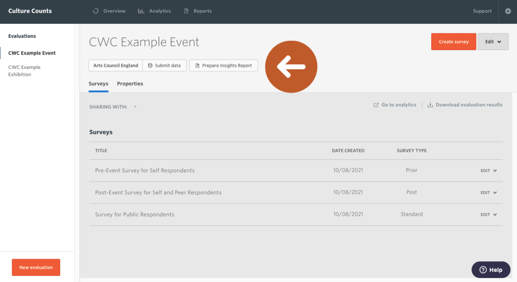
- Confirm your data.
An auto-generated report of the selected evaluation will open. The data is pulled automatically from your evaluation. Data will be shown for responses to dimensions, demographics and custom questions. If no data was collected for a particular question, it will not be listed.
If you completed the evaluation properties when setting up your evaluation, then duration, event type, event artform(s), location and attendance will be included in the heading of your report. The artform(s) that appear will be the top-tier artform(s) only. If you inputted attendance size in the evaluation Properties section, your report will also include the margin of error for each average public dimension score.
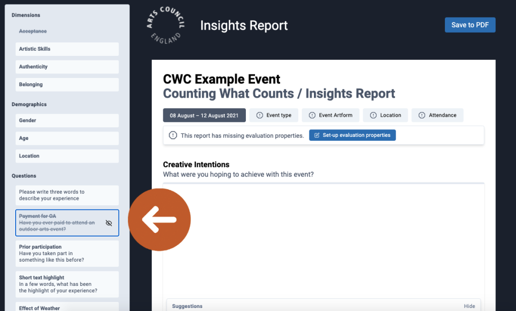
If you did not enter any information into the Properties section, the message ‘This report has missing evaluation properties’ will appear. Click the ‘Set-up evaluation properties’ button to add evaluation properties.

- Select the dimension, demographic and custom questions you wish to include in the report.
You can click on a question in the panel to select or deselect it.
- Explore and interpret your charts.
An important stage in creating the report is to understand what the data can tell you about how people experienced the event. The charts in the report, combined with any commentary you collected from peer and public respondents, can help you understand:
- What kind of experience it was for people – which dimensions scored most highly?
- Whether peers and public experienced the event in the same way.
- How well aligned peer and public responses were with your original intentions for the event.
- How much variation there was in public scores – were people in close agreement, or was there a spread of opinion?
Click the ‘+ Annotation’ button under each chart to add your own commentary and context.

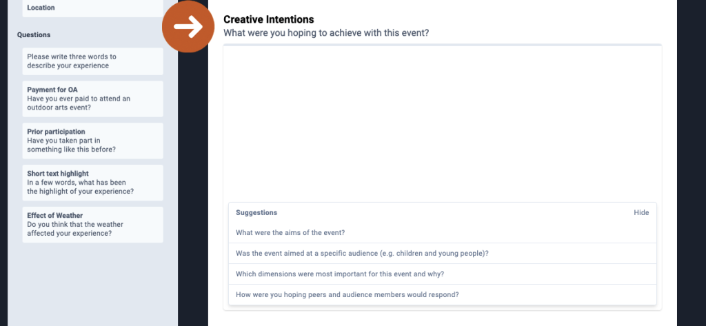
- Add your Creative Intentions.
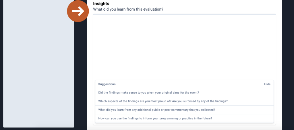
This is an opportunity to provide information about your event and what it set out to achieve. The word limit is 250 words; you can copy and paste into the text box if you prefer to begin writing elsewhere. Click the ‘Show’ button in the ‘Suggestions’ section for prompts about what to include.
- Add your Insights.
Similar to the Creative Intentions section, this text box allows you to share the insights you gained through the evaluation. The word limit is 250 words. Click the ‘Show’ button in the ‘Suggestions’ section for prompts about what to include.
Note: When you add text to your report, it will be saved automatically, giving you the option of coming back to the report to complete it at a later stage.
- Click the ‘Save to PDF’ Button.
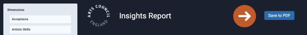
Your report will be saved as a PDF to your device. This report is yours, and you may share it with whomever you like, whether that be Board members, staff or external stakeholders.
If revisions are made to your evaluation data, you can update your Insights Report and again click ‘Save to PDF’ to save a copy of the updated version.
3. Appendix: Interpreting charts
Dimension averages (mean)
These charts provide a quick snapshot of dimension averages and highlight where the public, peer and self align or diverge in their level of agreement. Note: only dimensions shared across all respondent groups are shown in these charts.
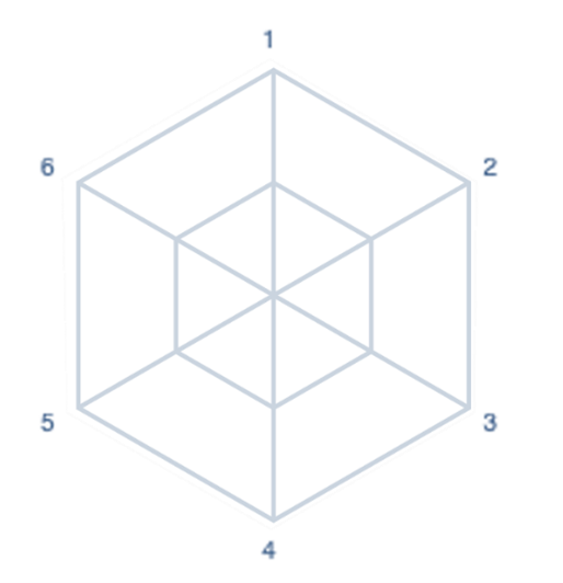
01 Dimensions are plotted on the form of a radar chart with two rings (inner and outer). The shape and number of axes will reflect how many dimensions have been selected.
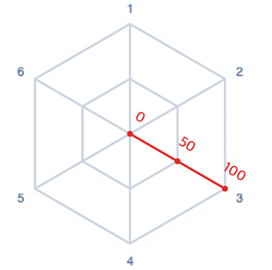
02 Each axis ranges from 0 to 100, where 0 is strongly disagree, 50 is neutral and 100 is strongly agree.
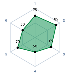
03 The average (mean) score for each dimension is plotted.
Intention vs outcome
These charts show self prior, peer and public mean averages. Dimensions are ordered from highest to lowest self prior. No line means that dimension was not asked of that respondent group.
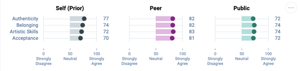
For example, an interpretation could be that, on average, peers consistently scored the event more highly than self assessors and the public.
Variation in public scores
This chart is a box and whisker plot. The vertical line shows the median public score. The bar shows the interquartile range. The middle 50% of public responses lie within this range. You can read more about box and whisker plots here.
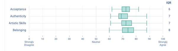
For example, an interpretation could be that although the dimension ‘Belonging’ has, on average, the highest public score, it was also the dimensions which the public gave the greatest range in response values.
Stacked level of agreement
This is a stacked bar chart. It shows the % of public responses which fall within a given range. Each range is represented by the different bars with labels below.
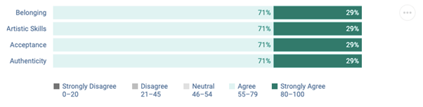
For example, an interpretation could be that across the four dimensions all public respondents either agreed or strongly agreed with the dimension statements.
Response distribution
These distributions offer a more in-depth look at how the public varied in their opinions. The taller the line at any given point, the larger proportion of the public respondents who gave that response. A single large peak indicates most people agreed. Multiple peaks indicate that there were varied opinions amongst the public respondents.
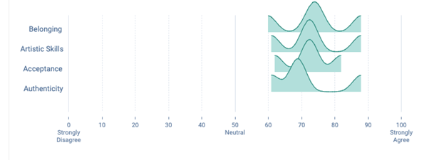
For example, an interpretation could be that the dimension ‘Authenticity’, despite the previous chart showing 71% of responses fell within ‘agree’, had the most people score it in the lower end of that section.
4. Glossary
Margin of Error
The margin of error represents how confident we are in our reporting of each dimension, based on the number of responses received. It shows how close we think the average public scores is to the ‘true’ average score of all audience members or visitors who experienced the work. The lower the margin of error, the more likely it is that the result is reflective of the total audience. A margin of error of 2% means that if you were to survey your entire audience, the resulting score would likely be within 2% above or below the reported score.
Quartiles
Quartiles tell us about the spread of a data set by breaking the data set into quarters. The top 25% of responses lie in the upper quartile and the bottom 25% of responses lie in the lower quartile.
Interquartile Range
Interquartile range is a measure of spread. It is defined as the difference between the upper and lower quartiles, or, the range in which the middle 50% of responses lies.
5. Troubleshooting
If your report doesn’t look correct or appears to be missing data, please ensure your evaluation is configured properly and that you have distributed your surveys to the correct respondents.
Possible causes:
- Evaluation properties for artform, location or attendance have not been added
- No peer assessor responses
- No self assessor responses
- Standard demographic questions are not used
- Dimension questions are not used
- The incorrect survey type has been used for the different respondent types (public respondents need a ‘standard’ survey type; self respondents need a ‘prior’ survey type; peer respondents need a ‘post’ survey type)
If you are trying to edit an Insights Report and you are not able to do so, this might be because another user from your organisation created the evaluation. The original creator of an evaluation is the only user that can write in the Intentions and Reflections text boxes.
The team at Counting What Counts is ready to support you. Please do not hesitate to get in touch with any questions.