1. Introduction
This guidance document takes you through using the Reporting Dashboard to conduct further analysis on your survey data and to explore benchmarking opportunities. To see this guidance in video format, please see the Reporting Dashboard 2026 section on our Vimeo channel.
Please know that all data presented in this guidance, along with the accompanying charts, is from erroneous evaluations, based on entirely fictitious arts and cultural works. No ‘true’ organisation’s data is being shown here or having the privacy of their data compromised.
For any questions or feedback about the dashboard, please get in touch with Counting What Counts at [email protected].
2. Overview
The Reporting Dashboard is available to all registered users of the Impact & Insight Toolkit and provides analysis and insight on survey data collected using the Culture Counts platform via the Impact & Insight Toolkit project.
It allows you to group together and compare data collected across multiple different surveys.
The primary uses of the dashboard are:
- Comparing and benchmarking survey results for the Dimensions questions, Question Bank questions and demographic questions
- Viewing the demographic makeup of the people you have surveyed, when standardised demographic questions are used
The secondary uses are:
- Exporting data collected using our Illuminate-Compliant Templates into an Illuminate-friendly format
- Exploring and applying the available benchmarks
- Analysing responses to your freetext questions (available on request)
- Using our Data Checker for Culture Counts data templates you intend to upload to the Culture Counts platform
All the charts and tables in the dashboard can be downloaded at the click of a button, and a PDF benchmarking report can also be created and downloaded.
For any questions or feedback about the dashboard, please get in touch with Counting What Counts at [email protected].
3. Logging in
You can access the dashboard via the Impact & Insight Toolkit website. It can be found in two places:
- Hover your mouse over the ‘Log in’ dropdown and click on the ‘Log in to the Toolkit Reporting Dashboard’ button.
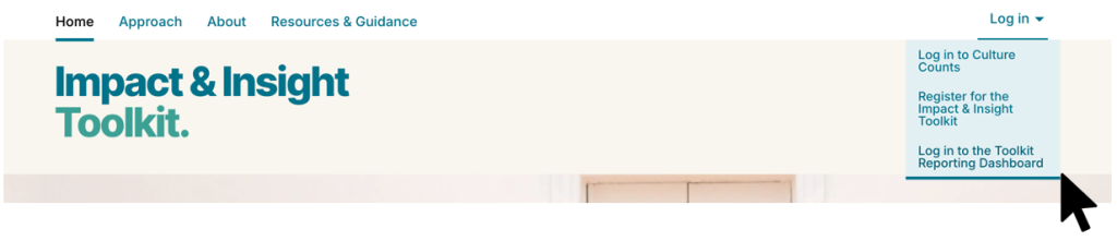
[Option 1 – accessing the dashboard via the ‘Log in’ dropdown]
- Hover your mouse over the ‘Resources & Guidance’ dropdown and click on the ‘Reporting Dashboard’ button.

[Option 2 – accessing the dashboard via the ‘Resources & Guidance’ dropdown]
Alternatively, the dashboard can be accessed directly via this URL: https://dashboard.impactandinsight.co.uk/
When prompted, enter the same username and password you use to log into the Culture Counts platform.
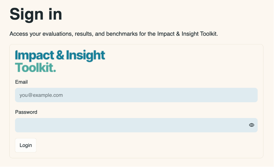
If your account is linked to multiple organisations, choose the organisation you want to use. If not, the dashboard opens directly.
If you refresh the page after logging in, you will need to log in again.
4. Page Guides
The dashboard has nine pages. Use the navigation bar at the left to access them. The navigation bar is separated into 5 categories: Workspace, Results, Configure, Tools, and Resources. The pages within these categories are:
- My Evaluations – contains a list of your evaluations and a few details about them.
- Evaluation Results – contains dimension results and question bank question results for a chosen evaluation
- Public Demographics – contains the demographics of your audiences/attendees/participants, when standardised questions are used
- Dimension Benchmarking – contains analysis of your dimension results compared to benchmarks across a group of evaluations
- Thematic Analysis – contains a thematic analysis of freetext data using an AI large language model
- Benchmark Selector – contains the available benchmarks which you can apply to your evaluations
- Benchmark Explorer – contains tables and charts for the available benchmarks
- Illuminate Export – contains formatted files from Illuminate-compliant evaluations, which can be downloaded and used for upload to Illuminate
- Data Import Clean & Check – contains a tool that checks the data from Culture Counts data template CSV files for errors
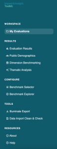
A guide on using each of the different pages follows. In addition to these main pages, there is also an About page and a Help page, which contain information about the dashboard.
4.1 My Evaluations
This page lists all the evaluations in the Culture Counts platform for the organisation you logged in with. It includes a table with information about each evaluation. To include evaluations shared with your organisation, turn on the ‘Show shared evaluations’ toggle.
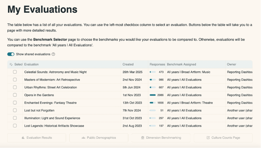
You can select evaluations from the table by clicking in the box to the left of the table.
If you select one evaluation, four buttons appear:
- Public Demographics. Click this to explore the demographic results for your singular evaluation, where standardised demographic questions were used.
- Dimension Benchmarking. Click this to benchmark the dimension results for your singular evaluation, where standardised dimension questions were used.
- Evaluation Results. Click this to explore the results for your singular evaluation.
- Culture Counts Page. Click this to be redirected to your selected evaluation on Culture Counts.
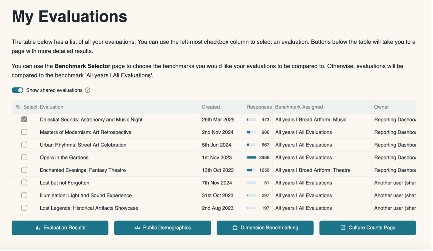
Clicking either of the first three buttons will open the corresponding page in the dashboard and will show data for the evaluations you select. Clicking ‘Culture Counts Page’ will open the evaluation in the Culture Counts platform in a new tab.
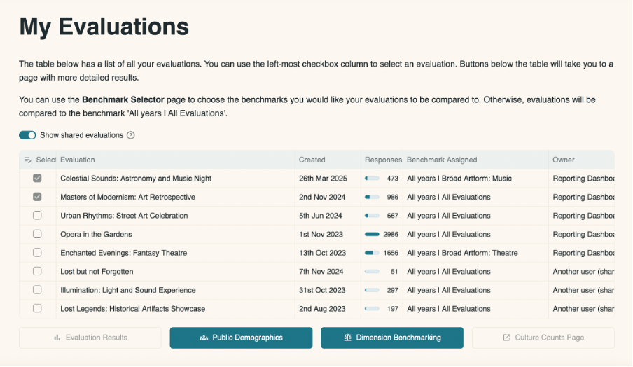
If you select multiple evaluations, only two buttons will appear:
- Public Demographics. Click this to explore the demographic results for your selected evaluations combined, where standardised demographic questions were used.
- Dimension Benchmarking. Click this to benchmark the dimension results for your selected evaluations combined, where standardised dimension questions were used.
4.2 Evaluation Results
This page shows your dimension results and question bank question results for the chosen evaluation compared to benchmarks and your other evaluations.
An evaluation must be selected before this page will load. If you didn’t arrive at this page having selected an evaluation from the My Evaluations page, you will first need to select one from the options at the top of the page before you will see any content. Select an evaluation by clicking in the box to the left-hand side of it. You can filter the evaluations by date range by moving the slider along the bar and then select from those that appear within the selected range.
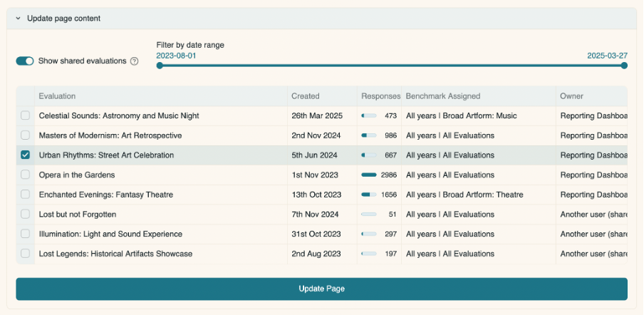
After you select an evaluation, the page loads its results. Any chart on the page can be downloaded, by clicking on the downwards pointing arrow in the top right corner of the chart. You can also resize any of the charts on this page prior to clicking the download button, if you want to change the shape of the downloaded chart. To do this, click and drag on the bottom right-hand side of the chart.
4.2.1 Metadata
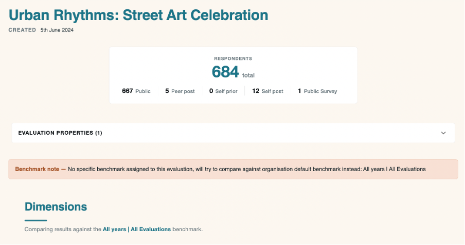
The first part of the page shows you information about the evaluation, including:
- When it was created
- The number of survey responses collected
- The evaluation properties, such as artform and event type, in a dropdown list
- The benchmark applied to this evaluation
These details come from both information automatically saved by Culture Counts (e.g., when the evaluation was created) and the tags which you add to the evaluation on the Properties tab in Culture Counts.
By default, the benchmark applied to your evaluation will be taken from all evaluations within the Culture Counts database. You can choose a more specific benchmark to apply in the Benchmark Selector page.
4.2.2 Dimension Question Results
This section shows a chart of the average value for each dimension used in this evaluation compared to the average value from the benchmark which you have selected from the Benchmark Selector page.
In the diagram below, the orange bar is the result from the evaluation which you selected to view. The purple bar is the benchmark you have selected to compare to.
In this example, the evaluation results for the all the dimensions are higher than the chosen benchmark.
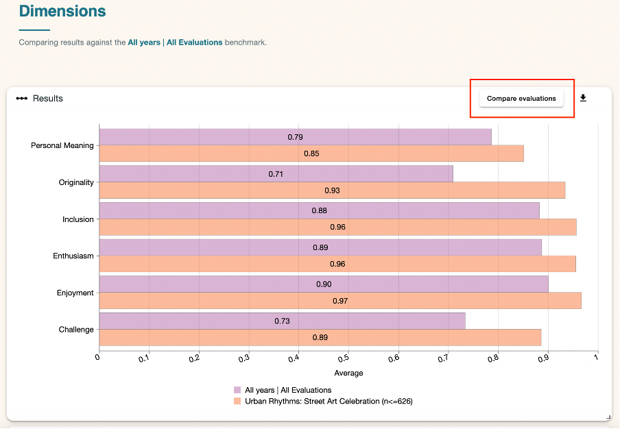
In the top right-hand corner of the chart is a ‘Compare evaluations’ button. Click it to compare the results for your dimensions from this evaluation to all other evaluations from your organisation, where the same dimension has been used.
See the Dimension Question Results Comparison section of the guidance for an explanation on comparing evaluations.
4.2.3 Evaluation Table for Dimension Results
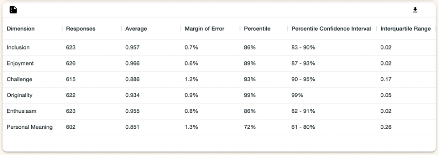
This table shows you your dimension results for the evaluation you selected:
- Dimension – the name of the dimension.
- Responses – the number of public responses for that dimension.
- Average[1] – the mean average response for that dimension.
- Margin of Error[2] – the margin of error for that dimension as a percentage.
- Benchmark Percentile[3] – where this dimension result sits compared to other results in the benchmark. A percentile is shown on a scale from 0-100%.
- Percentile Confidence Interval[3] – where this dimension result sits compared to other results in the benchmark provided as a range, considering the margin of error. A percentile confidence interval shows two percentages, between 0 and 100%.
- Interquartile Range[4] – how spread out the responses were for that dimension. The closer the Interquartile Range is to 0, the closer together all the responses were for this dimension.
Hovering the cursor over the table headings will show an explanation of the data. To download the table as a CSV, click the arrow in the top right.
4.2.4 Question Bank Question Results
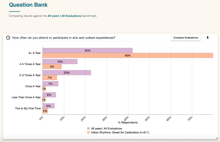
These charts show the results of any question bank questions used in the evaluation and compare them to the benchmark chosen on the Benchmark Selector page. For example, in the diagram below we are looking at the results for the question ‘How often do you attend or participate in arts and culture experiences?’.
The selected evaluation appears in orange, and the benchmark is in purple.
In the top right-hand corner of the chart is a ‘Compare evaluations’ button. This takes you to a page where you can compare the results for your Question Bank question from this evaluation to all other evaluations from your organisation which have used the same question. See the Question Bank Question Results Comparison section of the guidance for an explanation on comparing evaluations.
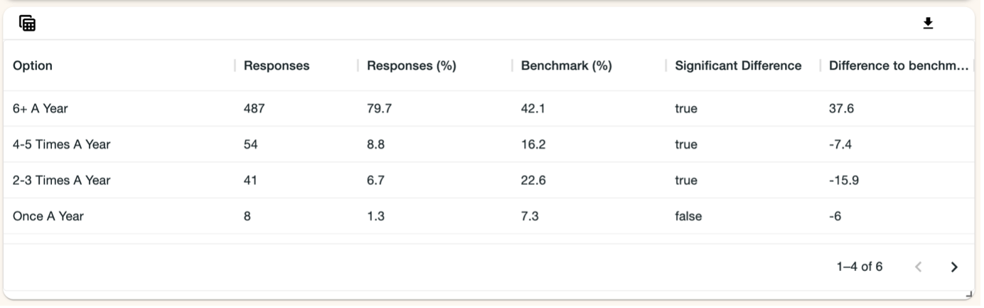
Each chart has a values table underneath it which shows:
- the total number of responses to each option
- the percentage that each option makes up (out of all the responses to the question)
- the equivalent percentage for each option within the chosen benchmark
- whether there is a statistically significant[5] difference between the response percentage and the benchmark percentage
If a question contains lots of options, use the arrows in the bottom right-hand corner of the table to go to the next page.
If the differences between your results and the benchmark are statistically significant [5], they will show in the list at the bottom of the page. It will show how many statistically significant results there were for each of the questions on the page.
To download the results as a csv. file, click the downward arrow button in the top-right hand corner of the chart.
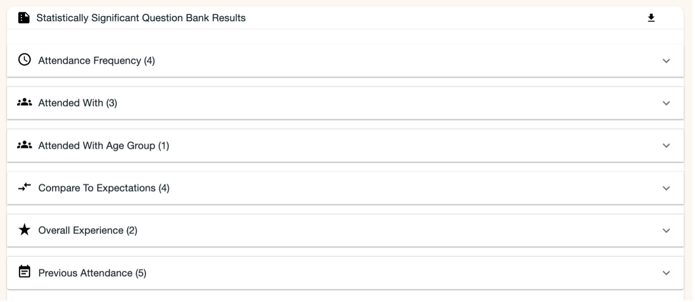
Click on one of the downward arrows on the chart to expand the selection and see the individual results.
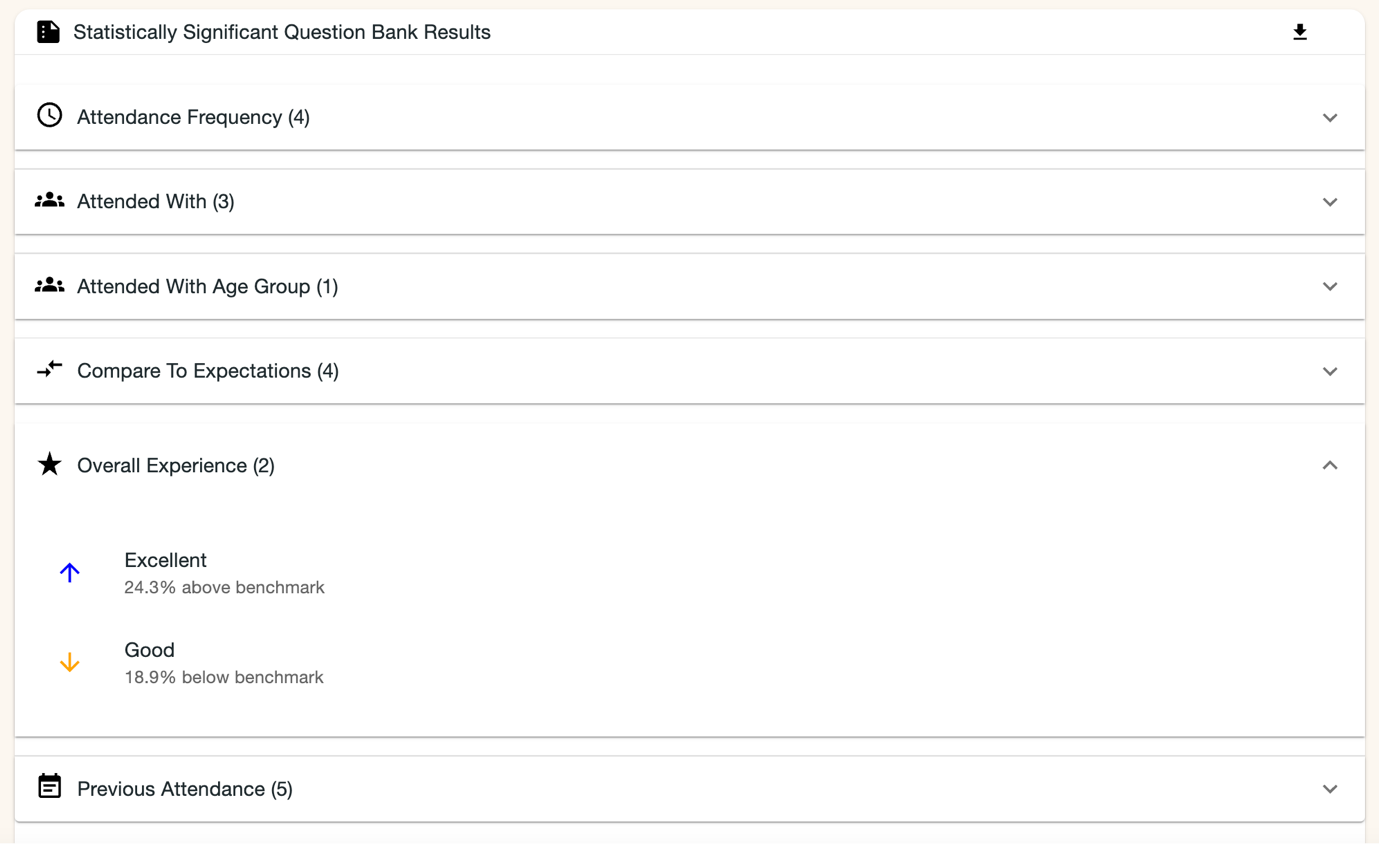
For example, here we can see that for the Overall Experience question, 18.9% fewer respondents said that their overall experience was good compared to the benchmark; 24.3% more said that their experience was excellent compared to the benchmark. No other results for this question were statistically significant.
4.2.5 Dimension Question Results Comparison
At the top of this page are the names of the dimensions used in the evaluation. Click on each one to see information for that question.
Underneath is information about the benchmark used:
- Which benchmark is used
- The average benchmark percentile for this dimension
- How many evaluations and organisations contributed to this benchmark
You can choose to hide evaluations from your comparison chart for each dimension. Click on the dropdown button to select any evaluations you wish to hide. If a dimension question has been answered in more than 50 of your evaluations, then the evaluations with the fewest number of responses will be hidden automatically. You can add them back in if you wish.
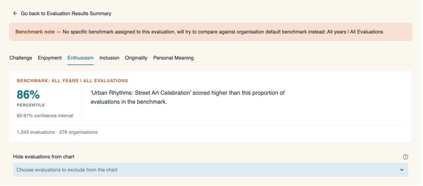
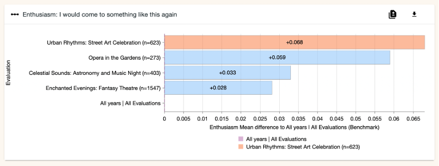
There is a chart for each dimension in the evaluation, showing the average value for this evaluation compared to all other evaluations from your organisation which have used the same dimension. It also shows the average value from the benchmark being used.
In the chart below, the orange bar is the result from the selected. The purple bar is the benchmark. The blue bars are the other evaluations which use the same dimension.
In this example, the evaluation result for the Enthusiasm dimension is higher than the other evaluations compared to, as well as the benchmark.
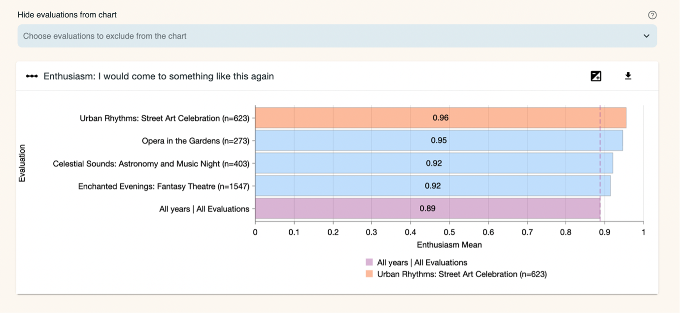
In the upper right of the chart there are two buttons. The left-hand button is a toggle to show the difference between the evaluation results and the benchmark instead of the evaluation result itself. The right-hand button downloads an image file (.png format) of the chart.
Underneath the chart is a table which shows for each dimension in each evaluation:
- The number of public responses
- Mean average
- Median
- Lower, Upper and Interquartile Range
The table highlights the selected evaluation in red. Scroll down the table to see more results that contribute to the chart. Hover over the table and, in the top right-hand corner, four icons appear and give the option to: choose which columns to include; download the data as a CSV file; search the table; enlarge the table to fullscreen.
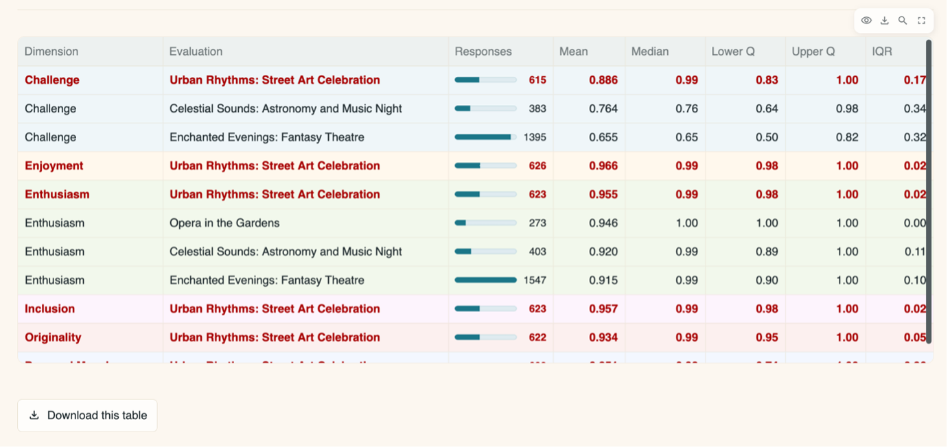
Download the table to an Excel Workbook by clicking the button underneath it.
4.2.6 Question Bank Question Results Comparison
This page shows the selected benchmark for this evaluation.
It also allows the user to hide evaluations from charts. If a Question Bank question has been answered in more than 50 of your evaluations, the evaluations with the fewest number of responses will be hidden automatically. You can add them back in if you wish.
There is a chart for the Question Bank question you are comparing, showing the average value for this evaluation compared to all other evaluations from your organisation which have used the same question. It also shows you the average value from the benchmark being used. In the diagram below, the orange bar is the result from the evaluation which you selected to view. The purple bar is the benchmark you have selected to compare to. The blue bars are your other evaluations which use this same question.
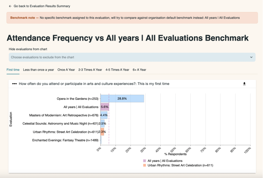
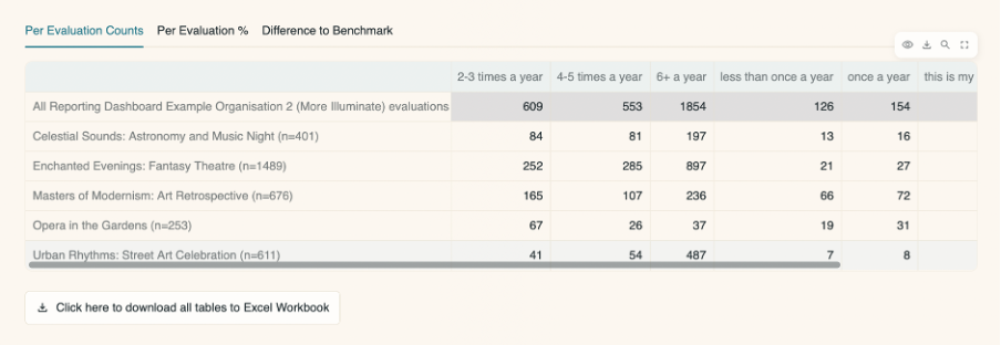
The tables underneath the chart present the data in three ways. Hover over each table and in the top right-hand corner four icons will appear giving you the option to choose which columns to include, download the data as a CSV file, search the table, and enlarge the table to fullscreen.
You can also use the scroll bars at the bottom or side of the tables to view all columns and rows. You can download the tables to Excel Workbook by clicking the button underneath them.
Data Tables
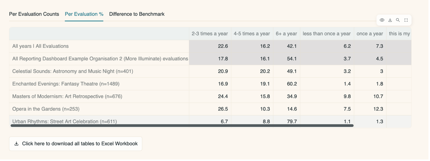
Per Evaluation Counts
The number of responses for each specific answer from each evaluation. The total for all evaluations is also included.
Per Evaluation %
The percentage of respondents that gave each specific answer for each evaluation. The total percentages for all evaluations and for the chosen benchmark are also included.
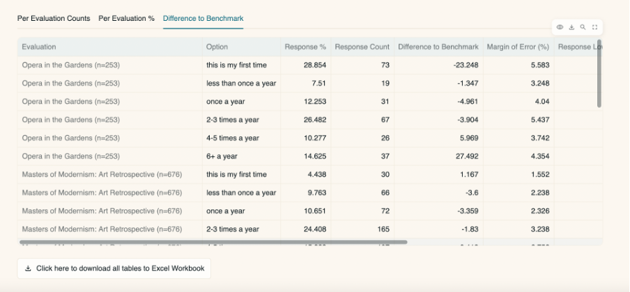
Difference to Benchmark
The difference between the percentage for a specific answer in an evaluation against the percentage for the chosen benchmark. A further breakdown of the data is also shown with the margin of error (%) and response lower and upper confidence (%).
You can go back to the page you came from by clicking on the ‘Go back to Evaluation Results Summary’ button in the top left-hand side of the page.
4.3 Public Demographics
This page presents the results of any inbuilt, standardised, demographic questions from one or more evaluations, assuming they are present in your surveys and were used to collect data from members of the public.
Demographic questions relating to the following characteristics will display in the dashboard:
- Age
- Gender identity
- Sex
- Gender same as assumed
- Disability
- Neurodivergence
- Ethnicity
- Socioeconomic status
- Sexual orientation
- Religion
- Country of residence
If you arrive at this page having selected specific evaluation(s) on the My Evaluations page and clicked through, the evaluations you selected will automatically load. If not, you will need to choose one or more from the menu.
4.3.1 Select evaluations menu
You can select evaluations individually from the list, or filter them by date range using the slider along the bar. You can then select from the evaluations that appear within the selected date range. If you would like shared evaluations to appear in the list of options, then toggle on the ‘Include shared evaluations’ button.
Selecting evaluations:
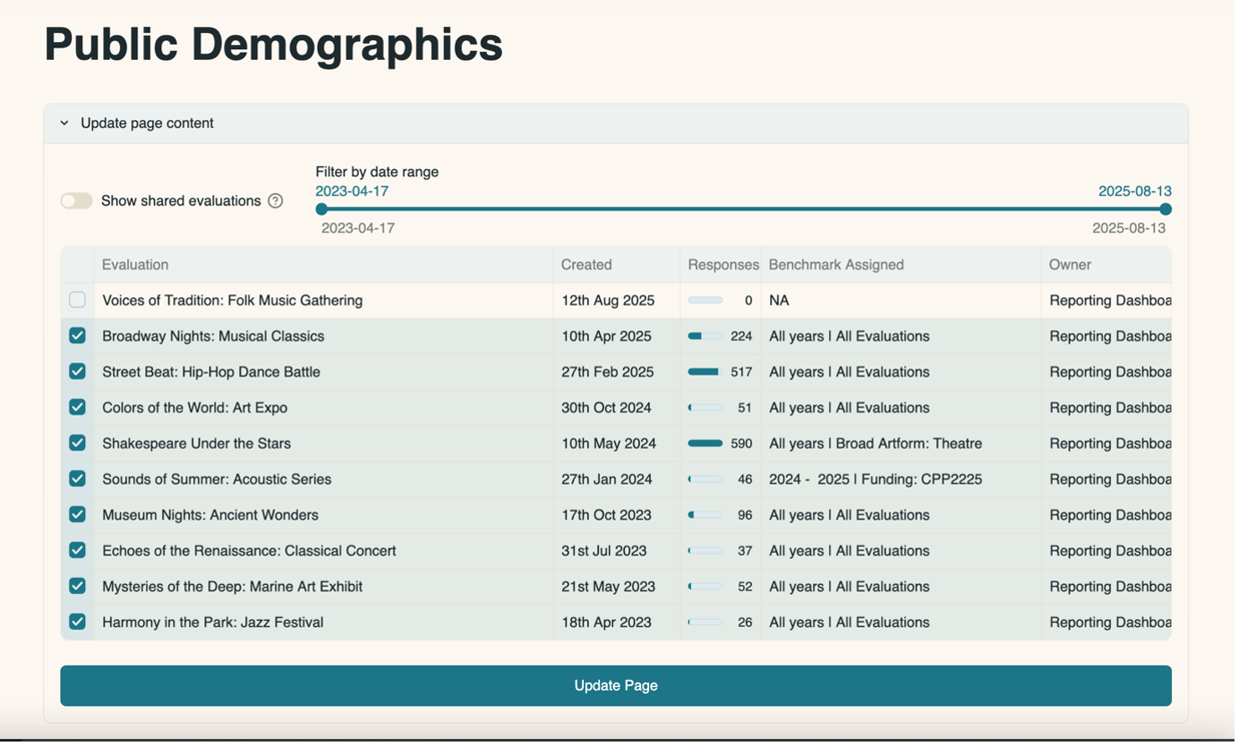
Having made a selection, click the ‘Update Page’ button for your choice to be reflected in the page.
4.3.2 Demographic benchmarks
You can select the demographic benchmark you wish to compare to. The benchmarks available originate from two different data sources:
- ONS: The Office for National Statistics Census 2021
- Impact & Insight Toolkit: Data from other UK-based organisations using Culture Counts and registered for the Toolkit.
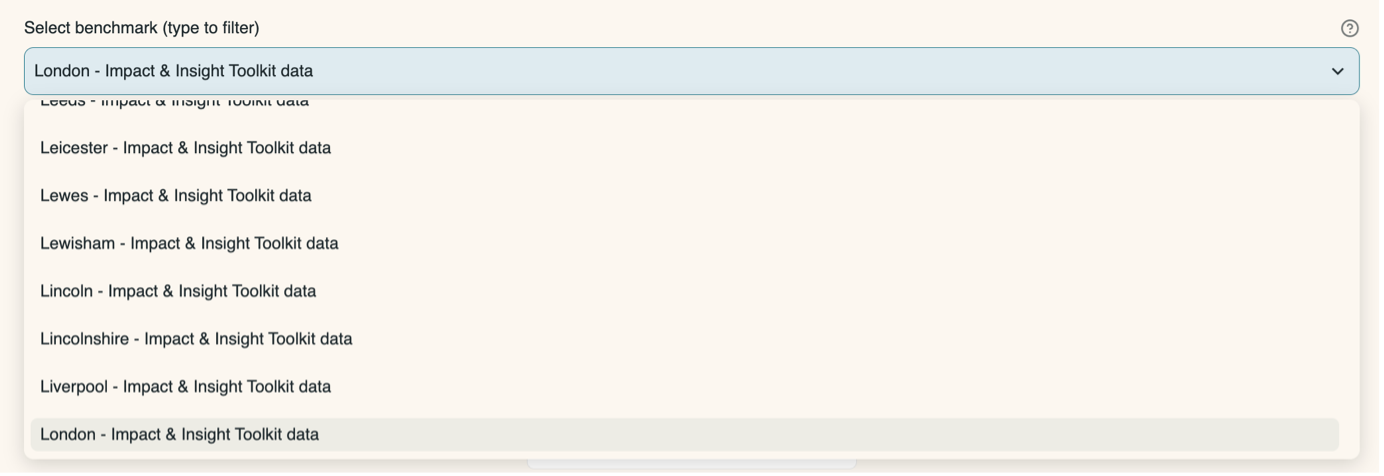
If your organisation is based in a local authority with many other organisations, it is possible that a local authority benchmark will appear as an additional option. Benchmarks are listed in alphabetical order, and you can also type in the box to find a benchmark. If you do not wish to compare to a benchmark, select ‘No benchmark’ from the list.
The top of the page will show some information about what information is being reported on in the charts on this page.
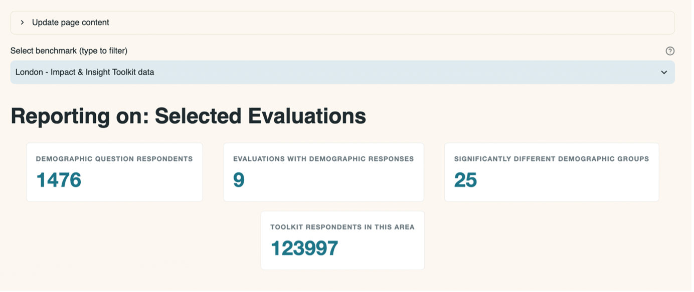
4.3.3 Demographic Charts and Tables
A chart will be displayed for each standardised demographic question present in the selected evaluations.
All the charts are bar charts, with either horizontal or vertical bars, and the components which make up each chart are the same.
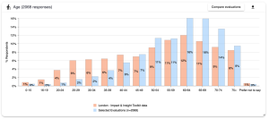
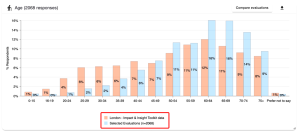
The bars representing the selected evaluations are shown in blue and the bars representing the chosen benchmark are shown in orange. There is a legend on the chart to indicate this.
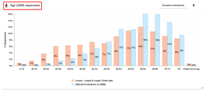
At the top of the chart on the left-hand side, there is a word or short phrase identifying which question the chart relates to, and how many public survey responses are reflected in the chart.
On the right-hand side there is a downward pointing arrow which allows you to download the chart as an image file (.png).
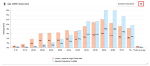
To the left of the ‘download’ button is a ‘Compare evaluations’ button. This takes you to a new page where you can compare results for each of the evaluations you selected individually. See the Compare Evaluations section of the guidance for an explanation on comparing evaluations.
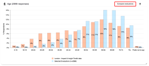
Underneath each chart are two tables of information:
4.3.4 Values Table
This table shows:
- the total number of responses to each option
- the percentage that each option makes up (out of all the responses to the question)
- the equivalent percentage for each option within the chosen benchmark
- whether there is a significant difference between the response percentage and the benchmark percentage or not
If a question contains lots of options, you can use the arrows in the bottom right hand corner of the table to go to the next page.
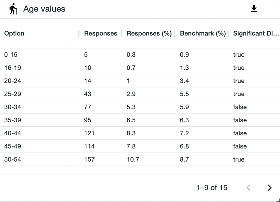
For instance, let’s look at the first option in the table above, ages 0-15.
5 respondents to the evaluations we are looking at said they were aged between 0-15 years old.
This makes up 0.341% of all responses to this question in our selected evaluations.
However, the next column, Benchmark %, shows a figure of 0.928%. This means that the data which fuels the chosen benchmark (in this instance, London Toolkit data) has 0.928% of respondents saying they are aged between 0-15 years old.
When we look at these two figures (0.341% and 0.928%), we can see that there is a difference. Whether this difference is statistically significant or not will be indicated in the final column. If it says ‘true’, the difference is significant; if it says ‘false’, it is not significant.
This information is useful as it may prompt you to consider whether you would expect your selected evaluations to have respondents of a skewed demographic, and why that might be.
4.3.5 Contributing Evaluations Table
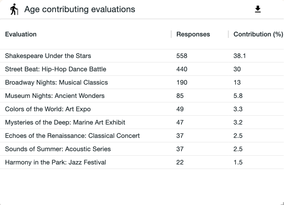
This table shows the total number and the percentage of responses each evaluation contributes to the total for that demographic question.
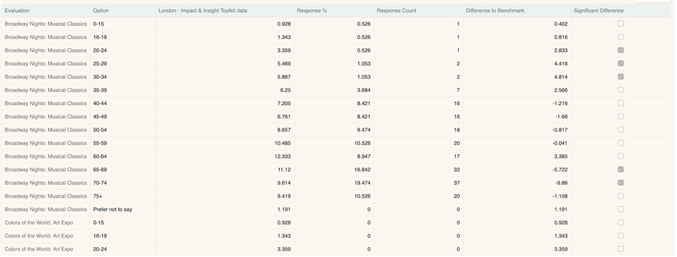
4.3.6 Comparing Evaluations
After clicking the ‘Compare evaluations’ button, you are taken to a new page which focusses on the demographic question selected.
On this page, you can select a specific answer in the chart for that question (e.g., 50-54 for the age question) and see the results for each evaluation.
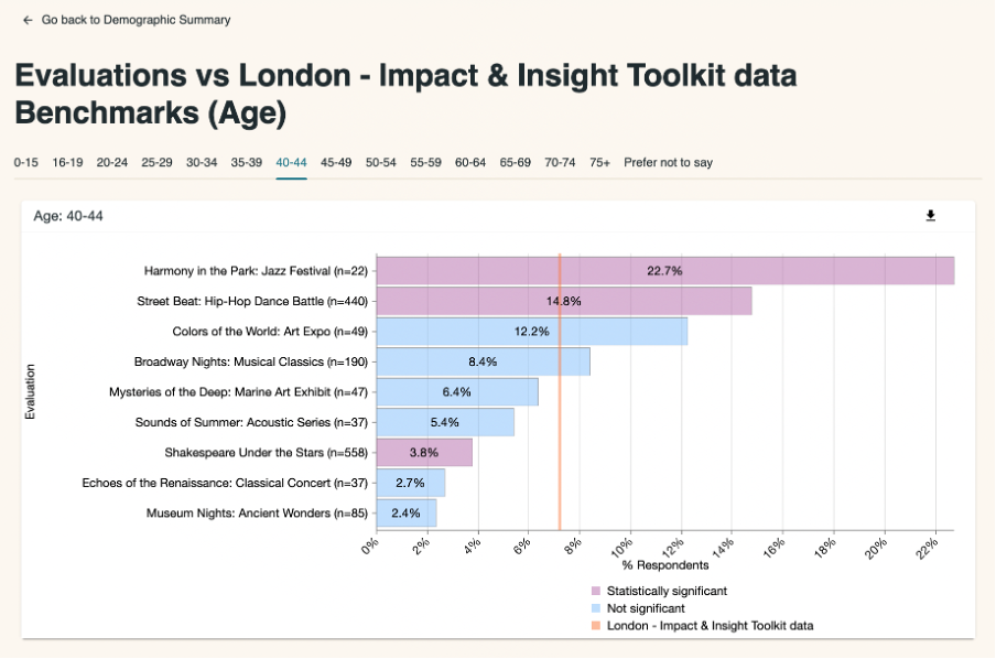
The benchmark is shown as a vertical orange line, and the bars are colour-coded to indicate whether the difference to the benchmark is statistically significant. Purple indicates the difference between that evaluation’s result and the benchmark is statistically significant, and blue indicates it is not.
The Data Tables section underneath the chart presents the data in three tables. Hover over each table and in the top right-hand corner three icons will appear giving you the option to download the data as a csv. file, search the table and enlarge the table to fullscreen.
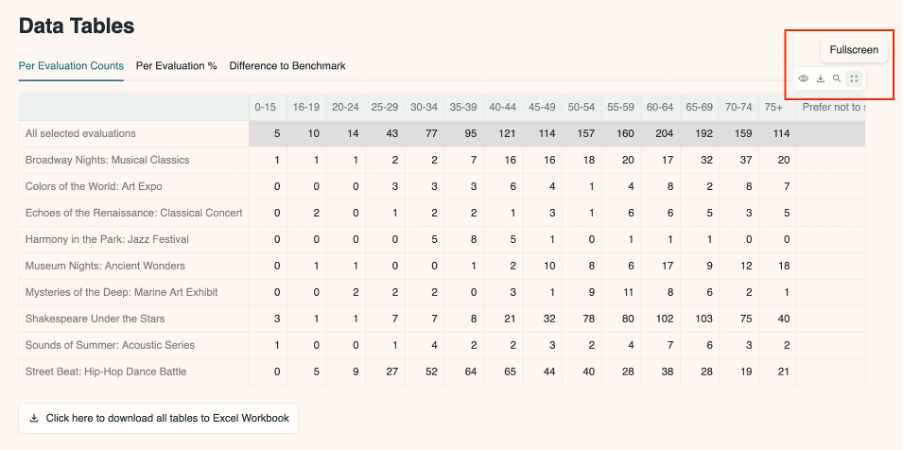
Per Evaluation Counts
The number of responses for each specific answer from each evaluation. The total for all selected evaluations is also included.
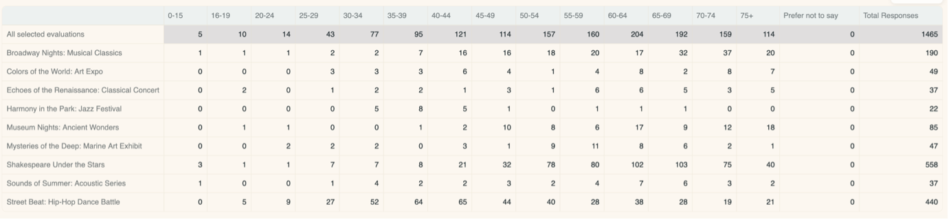
Per Evaluation %
The percentage of respondents that gave each specific answer for each evaluation. The total percentages for all selected evaluations and for the chosen benchmark are also displayed.
Difference to Benchmark
The difference between the percentage for a specific answer in an evaluation against the percentage for the chosen benchmark. Any significantly different results are ticked in the table.
You can go back to the page you came from by clicking on the ‘Go back to Demographics Summary’ button in the top left-hand side of the page.
4.3.7 Statistically significant results
Here is a summary of statistically significant results.
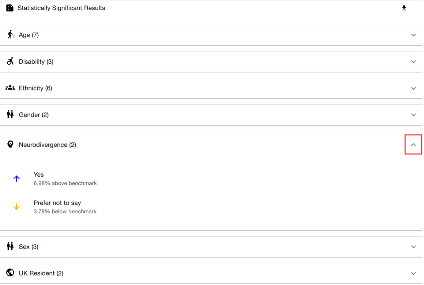
It shows how many statistically significant results there were for each of the questions on the page. It also allows you to view what those results are and the difference to the selected benchmark.
The results can be downloaded as a csv. file by clicking the downward arrow button in the top-right hand corner of the chart.
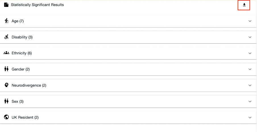
By clicking on one of the downward arrows on the chart, you can expand the selection to see the individual results.
4.4 Dimension Benchmarking
This page focusses on analysing results of the dimension questions by comparing them to benchmarks.
The reason for comparing dimension results to benchmarks is because we know from research and experience that people (audience members, participants etc.) respond differently to the dimension questions when they are experiencing different types of work.
By selecting a benchmark which is specific to the type of evaluated work, you can account for the differences between the type of work and therefore make fairer comparisons across your different evaluations and for the different dimensions.
This allows you to make more accurate assessments about which of your chosen dimensions you are achieving more than others.
Therefore, to get the most out of the analysis on this page, we recommend that you select benchmarks which are relevant for your works. This might look like selecting the ‘type: participatory’ benchmark if your evaluated work was of the participatory type, or the ‘broad artform: dance’ benchmark if your evaluated work was dance. See the Benchmark Selector page on how to do this.
To use this page:
- Choose the evaluations you would like to analyse
- Filter the dimensions you wish to include in the analysis
Once you’ve done this, you can view the benchmark-focussed analysis.
4.4.1 Select evaluations menu
From the menu, you can select evaluations individually from the list and you can filter them by date range using the slider along the bar. You can then select from the evaluations that appear within the selected date range.
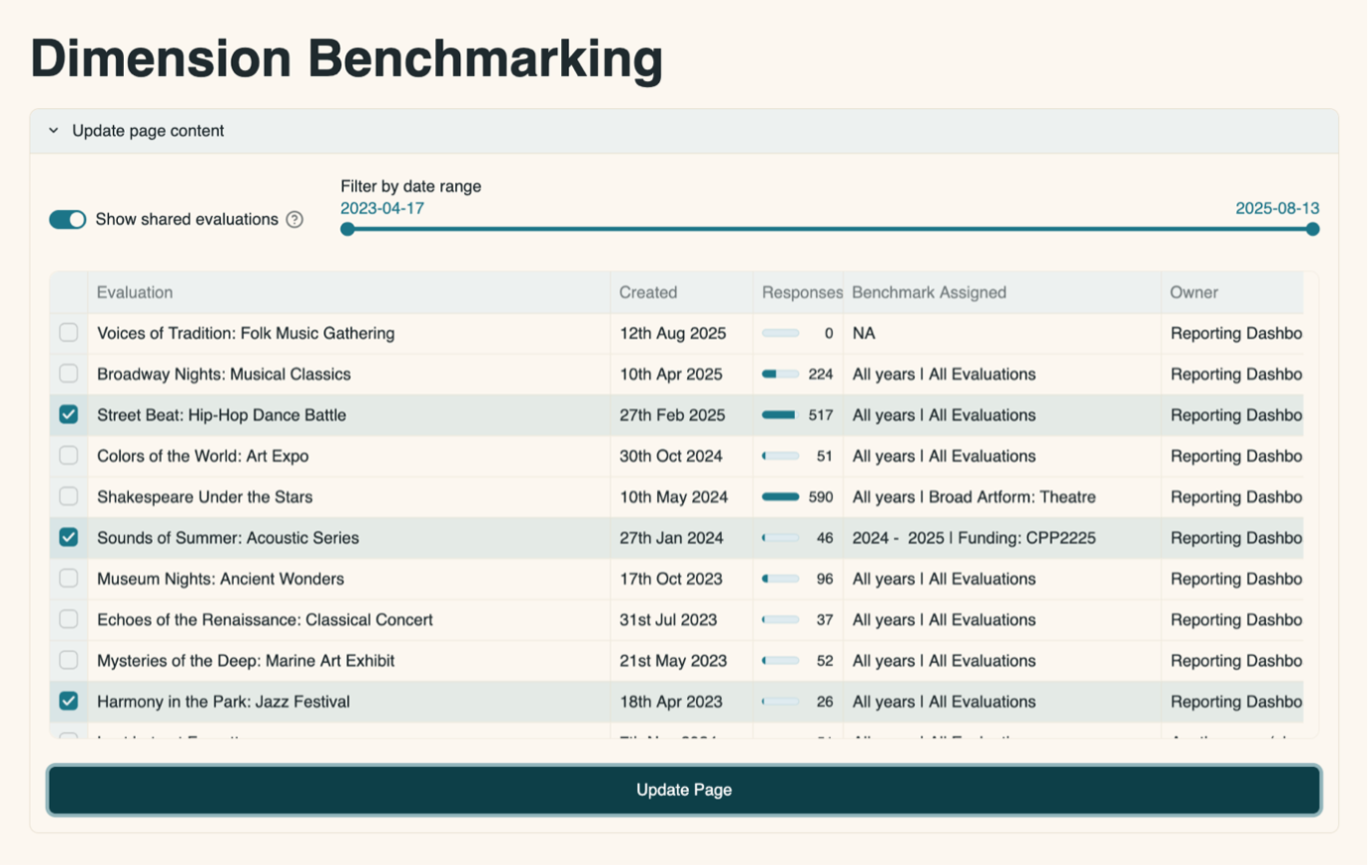
Using evaluation results from a specific date range means that you could choose to focus your analysis according to your needs in that moment, for specific meetings, applications or reports.
Having made a selection, click the ‘Update Page’ button for your choice to be reflected in the page.
4.4.2 Filter dimensions menu
By default, all dimensions which are included in the evaluations you have chosen will be shown in the filter box.
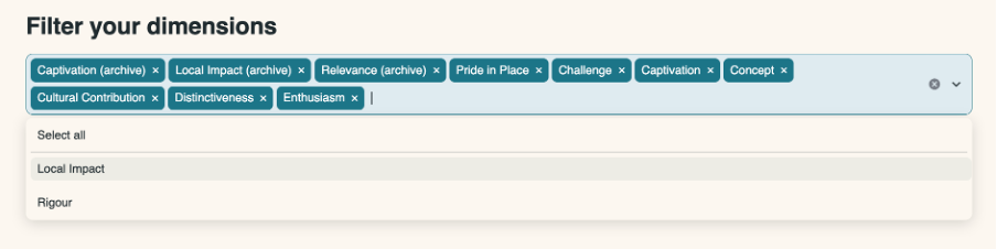
You click the cross on the right-hand side of each red box to remove a dimension from the list. Clicking anywhere in the grey-blue box will open the menu to see the dimensions which are currently excluded.
If you remove all dimensions from the list, the page will not load.

4.4.3 Dimensions used in your evaluations
This diagram shows which dimensions were used for the chosen evaluations.
For example, in the image below, we can see that the evaluation Sounds of Summer: Acoustic Series used the dimensions Captivation, Cultural Contribution, Distinctiveness, Enthusiasm and Rigour.
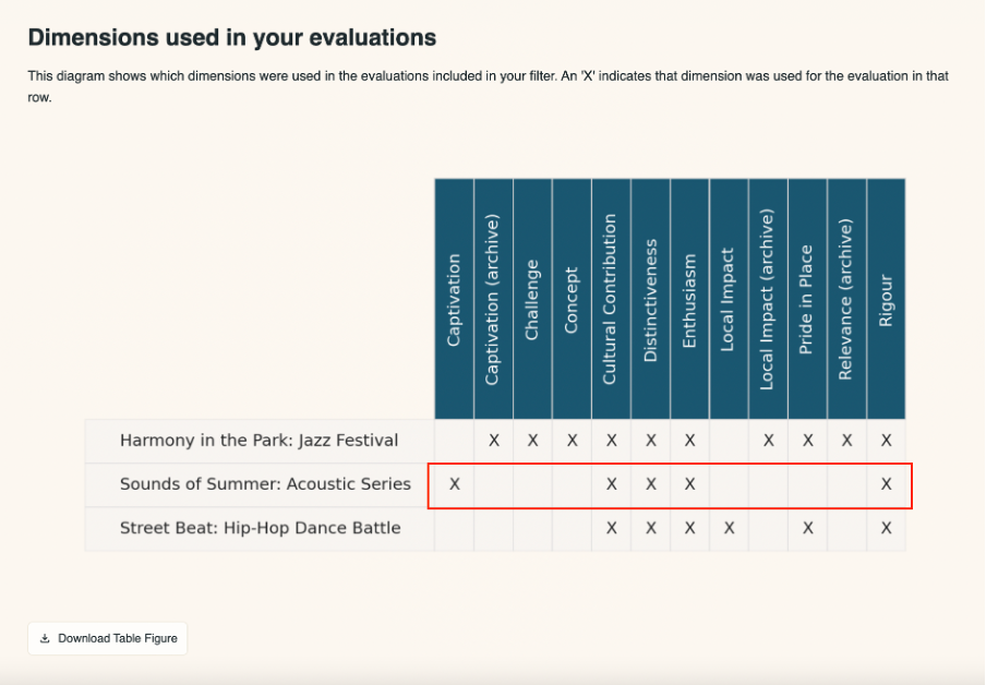
This diagram is used to guide you to which evaluations and dimensions you want to include in analysis. For example, you might want to focus the analysis on dimensions which were used consistently across multiple evaluations, and so would use this diagram to identify which those are and then filter out the dimensions that do not serve this purpose.
You can view a larger version of the diagram by hovering your mouse over the diagram and clicking on the arrows expanding icon in the top right-hand side of the diagram.
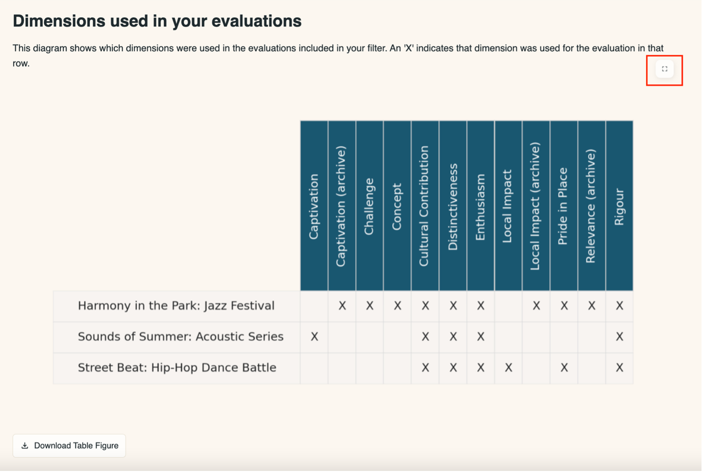
You can download a copy of the image by clicking the ‘Download Table Figure’ button beneath the diagram.
4.4.4 Average dimension performance against benchmarks
This chart shows the average of your dimension results as a percentile.
What do we mean by ‘Percentile’?
A dimension result is given a percentile by comparing it to other results from evaluations in the benchmark. The percentile will be in the range 0 – 100% and shows the position that results takes amongst the others in the benchmark.
A couple of examples:
- If the percentile is 95%, this dimension result is higher than 95% (and lower than 5%) of the results that make up the benchmark.
- If the percentile is 12%, this dimension result is higher than 12% (and lower than 88%) of the results that make up the benchmark.
Each evaluation can have a different benchmark. For instance, one of your evaluations might use the ‘Type: Participatory’ benchmark; another might use the ‘Type: Performance’ benchmark.
Each dimension result is compared to the benchmark chosen for that specific evaluation. A resulting percentile is established for each dimension. These percentiles are then averaged together to arrive at an overall summary of the results for that dimension.
In the example below, the dimension which achieved the highest results compared to benchmarks is Concept, and the dimension with the lowest results compared to benchmarks is Challenge.
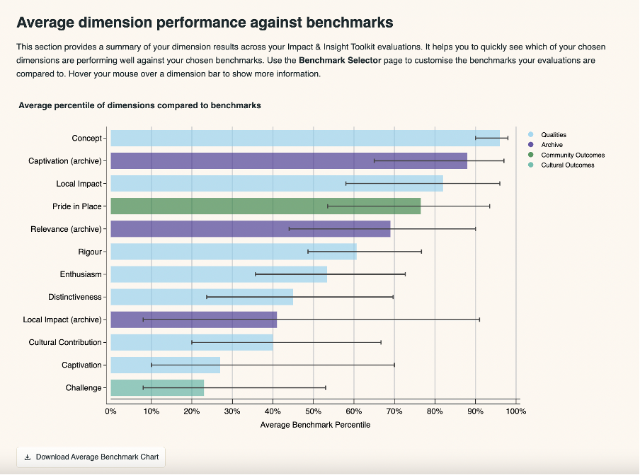
Hovering the cursor over the bars will show the exact figures for the:
- Dimension name
- Dimension domain
- Average percentile
- Percentile range
- Sample size
- Quantity of evaluations included
The percentile range is provided to account for the margin of errors in the dimension results. More evaluations and a larger sample size will typically result in a narrower range.
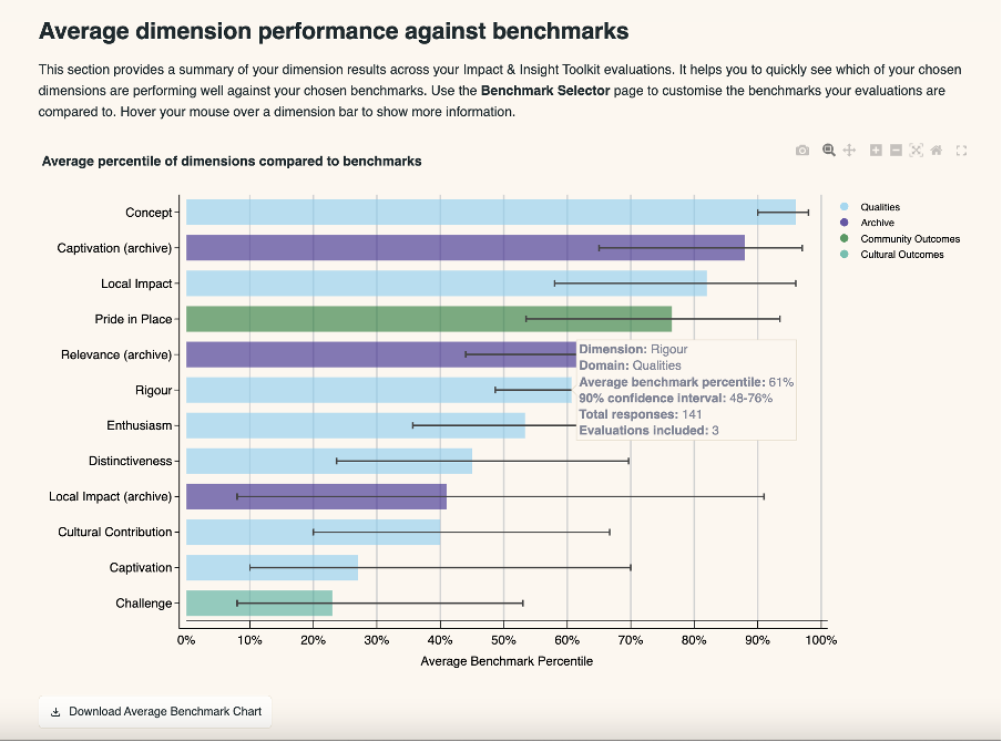
Beneath the chart is a table which shows the same information that’s available when you hover the cursor over a bar on the chart.
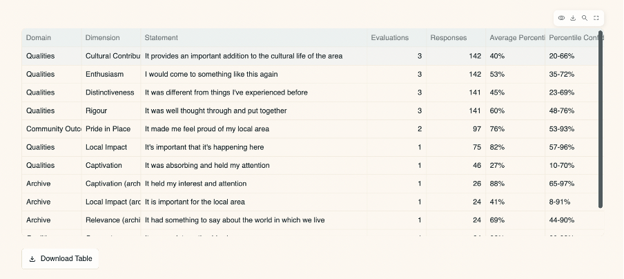
You can download both the chart and the table by clicking the ‘download’ button in the bottom left-hand side of the chart and table.
4.4.5 Dimension percentiles by evaluation
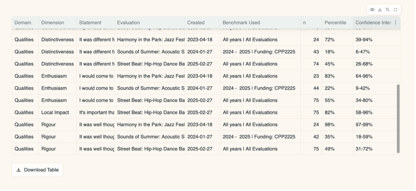
This section has a chart for each dimension and shows the benchmark percentiles for each evaluation which used that dimension. An example of a chart for the Distinctiveness dimension is below.
By using this chart, you can see which evaluations achieved higher or lower results when compared to the benchmark.
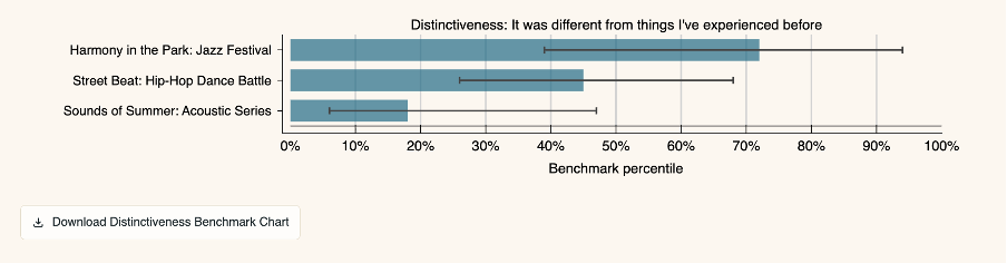
If you hover over each bar, further information is presented, including the benchmark that the result was compared to.
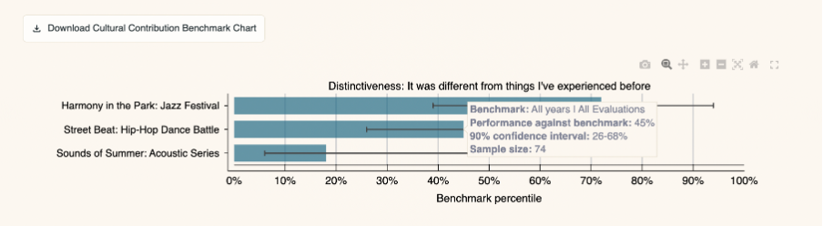
The information contained in the hover tooltip is available in a table at the end of this section of the page.
4.4.6 Excluded Evaluations and Dimensions
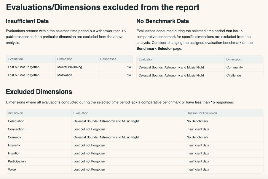
This section lists evaluations and dimensions that are excluded from one or more of the charts above. There are two reasons why an evaluation or dimension might be excluded:
- The evaluation has a low number of survey responses (less than 15). This would cause the margin of the error to be too large to make confident assumptions about the work being evaluated.
- The benchmark assigned to that evaluation has no data for a particular dimension. This might be because not enough data has been collected that’s associated with that benchmark and/or that dimension.
4.4.7 PDF Download
Download the charts and tables as a PDF for easy sharing. This downloadable report has been made available with the intention of supporting conversations around whether, and to what extent, ambitions are being met across your different evaluated works.
Find the PDF download button directly below the dimension selection box. Click this button to create and download a PDF file of the benchmarking report which contains the same content as the dashboard.

There are several things to note:
- This button will be disabled if there are more than 25 selected dimensions or 37 selected evaluations.
- The contents of the loaded web page will be included in the PDF, so if you update the list of evaluations in the menu at the top of the page, make sure to click ‘Update Reporting Period’ prior to clicking ‘Download PDF Report’.
- The PDF report can take some time to generate, depending on how many evaluations and dimensions are included.
4.5 Benchmark Selector
Here is where you select benchmarks to compare your dimension results to on the My Evaluations, Evaluation Results, and Dimension Benchmarking pages of the dashboard.
You can assign a different benchmark to each evaluation, and a default benchmark to be used when a specific benchmark hasn’t been assigned. To begin with, the default benchmark is set to ‘All years | All evaluations’ which includes data from all evaluations within the Culture Counts UK database from organisations which are participating in the Toolkit project.
4.5.1 Default benchmarks
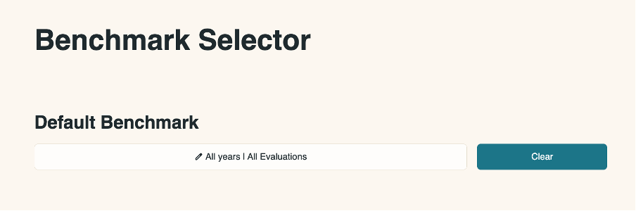
In this section you can select or clear the default benchmark used for the dashboard. This benchmark will be used in cases when a specific one hasn’t been assigned.
To open the controls for viewing and saving a benchmark, click on the white bar on the left.
The table in the pop-up box shows all available benchmarks.
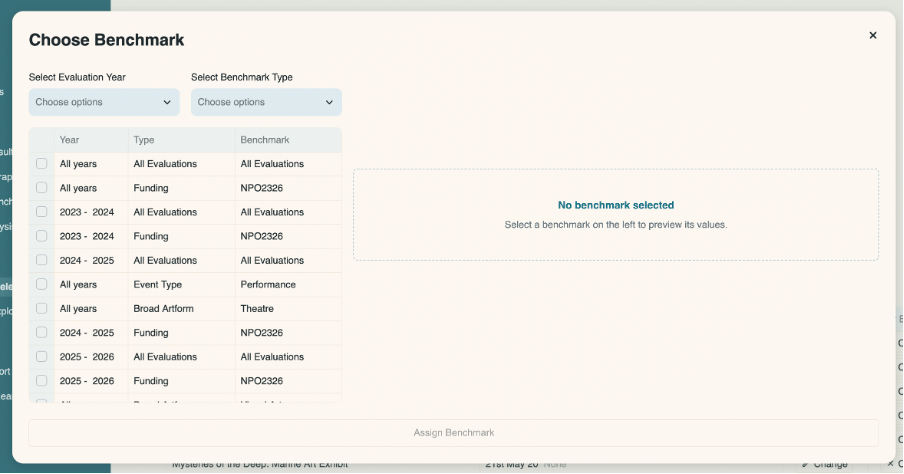
To order the table by Year, Type or Benchmark, click on the corresponding heading. To filter the benchmarks by year and type, click on the dropdowns and select the filter you wish to implement.
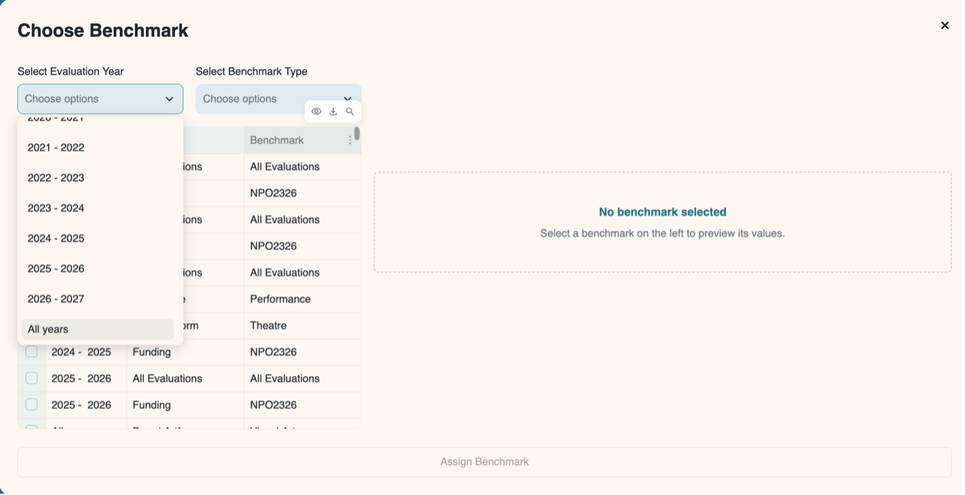
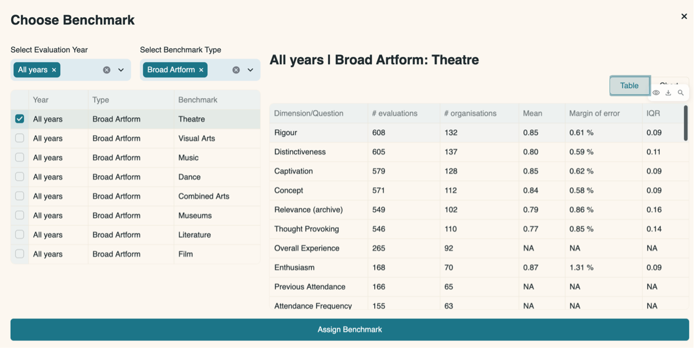
Once you select a benchmark by clicking on the box on the left-hand side of the table, more information will load on the right-hand side of the pop-up box.
It will show information about that benchmark, including:
- Which dimensions are available for that benchmark
- How many evaluations are included in the benchmark
- How many organisations are included in the benchmark
- The mean average result
- The margin of error
- The interquartile range
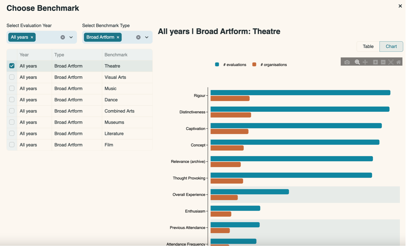
You can also view a chart which shows the number of evaluations and organisations that contribute to the benchmark for each dimension.
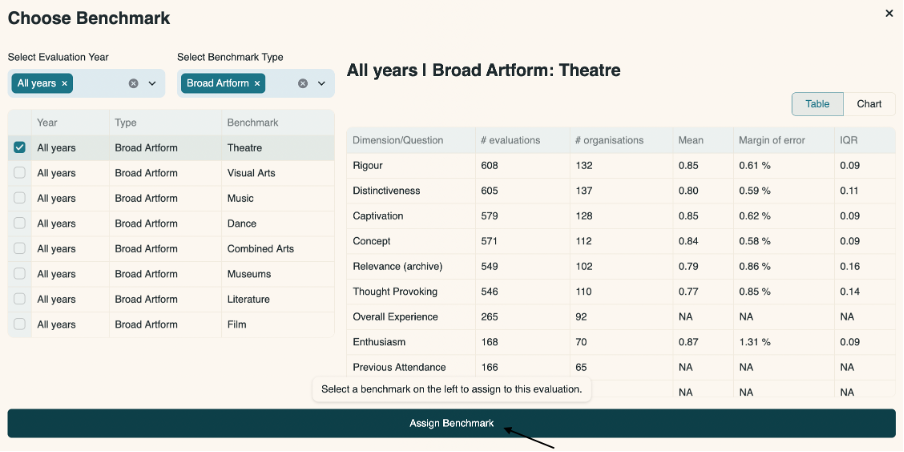
Click the Assign Benchmark bar at the bottom of the box to save that benchmark as your default.
You will see a notification in the top right-hand side of the page indicating that the benchmark was saved.
To the right-hand side of the default benchmark dropdown is a ‘Clear’ button.
Click ‘Clear’ to reset the default benchmark back to ‘All years | All Evaluations’. It is not possible to remove the default benchmark altogether as this is required for the dashboard to function.
4.5.2 Evaluation specific benchmarks
Here is where you assign specific benchmarks to each of your evaluations.
You can assign a different benchmark to every evaluation, or you can assign benchmarks to just a few of your evaluations and allow the rest to use the default benchmark. The choice is yours.
The table displayed on this page shows every evaluation created by your organisation in the Culture Counts platform, along with their creation date and whether they have a specific benchmark saved. Evaluations are ordered in alphabetically and you can scroll down the table on the right-hand side.
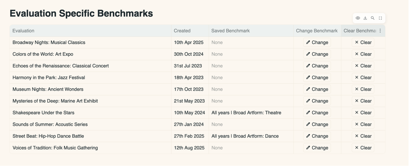
If a specific benchmark has not been selected for that evaluation, ‘none’ will appear under the column Saved Benchmark.
If a benchmark has been selected, the name of that benchmark will be shown.
To choose the benchmark you want to apply to that specific evaluation:
- Click the ‘Change’ button in the Change benchmark column of the table. The Dimensions and Question Bank questions that have been used in this evaluation are listed at the top of the pop-up box
- Choose which year of benchmark you want to apply to your evaluation
- Choose which type of benchmark you want to apply to your evaluation
- Check the box to the left-hand side of the ‘Year’ column of the benchmark you want to apply to your evaluation. Information for that benchmark will appear on the right-hand side of the pop-up box in a table. You can also view a chart which shows the number of evaluations and organisations that contribute to the benchmark for each question
- If the Dimension or Question Bank questions used in that evaluation are not represented in the chosen benchmark, the phrase ‘No benchmark’ will be displayed in the table.
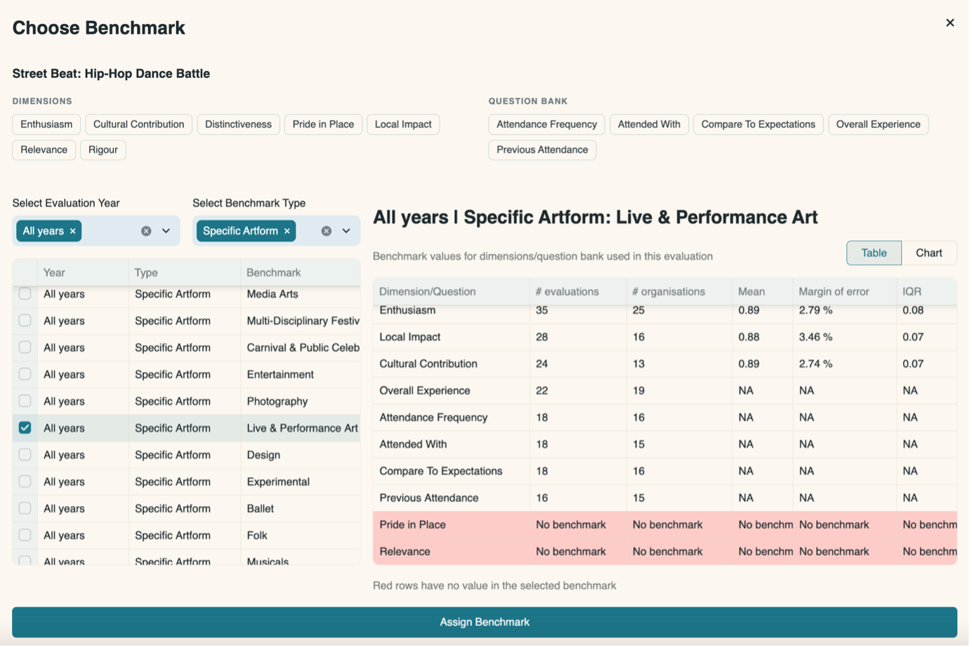
You can also view a chart which shows the number of evaluations and organisations that contribute to the benchmark for each dimension.

To confirm you wish to apply the selected benchmark to the evaluation, click ‘Assign benchmark’ at the bottom.
To remove an evaluation-specific benchmark, click the ‘Clear’ button under the Clear benchmark column of the table. This will delete any benchmark you have previously saved, and that evaluation will revert to using the default benchmark.
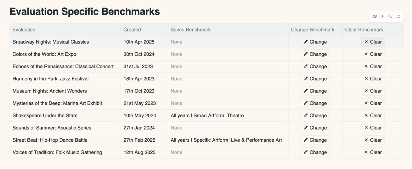
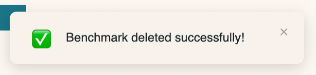
A notification will appear in the top right-hand section of the screen, indicating that the benchmark was successfully deleted.
4.6 Benchmark Explorer
This part of the dashboard is for you to view information about the dimension benchmarks that are available from the Toolkit.
The benchmarks are made up of results from Toolkit evaluations, tagged with the year they were created and various other characteristics. These characteristics might include the artform of the work; the work’s subject matter; an attribute of the work’s participants…
They are then grouped together by the year and the characteristics to produce a benchmark for that characteristic.
To be included in the benchmark for a particular dimension, an evaluation must contain at least 15 public responses for that dimension, which reduces the chances of a single evaluation skewing the results.
For a benchmark to be provided, there must be results from at least 15 evaluations in it and these evaluations must have been created by more than two organisations. This ensures that the benchmark is representative of that type of work in general, rather than just one organisation’s work.
The benchmarks can be viewed as either a table, or in a box and whisker plot[6]. You can toggle between how you wish to view the information using the control panel at the top of the page.

This control panel also has a selection of filters which you can use to filter the benchmarks in the table/chart.
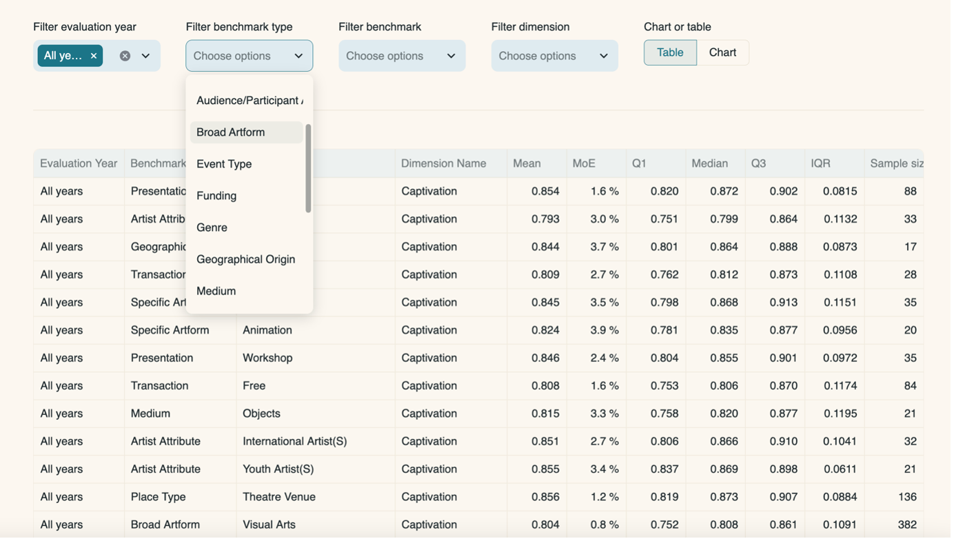
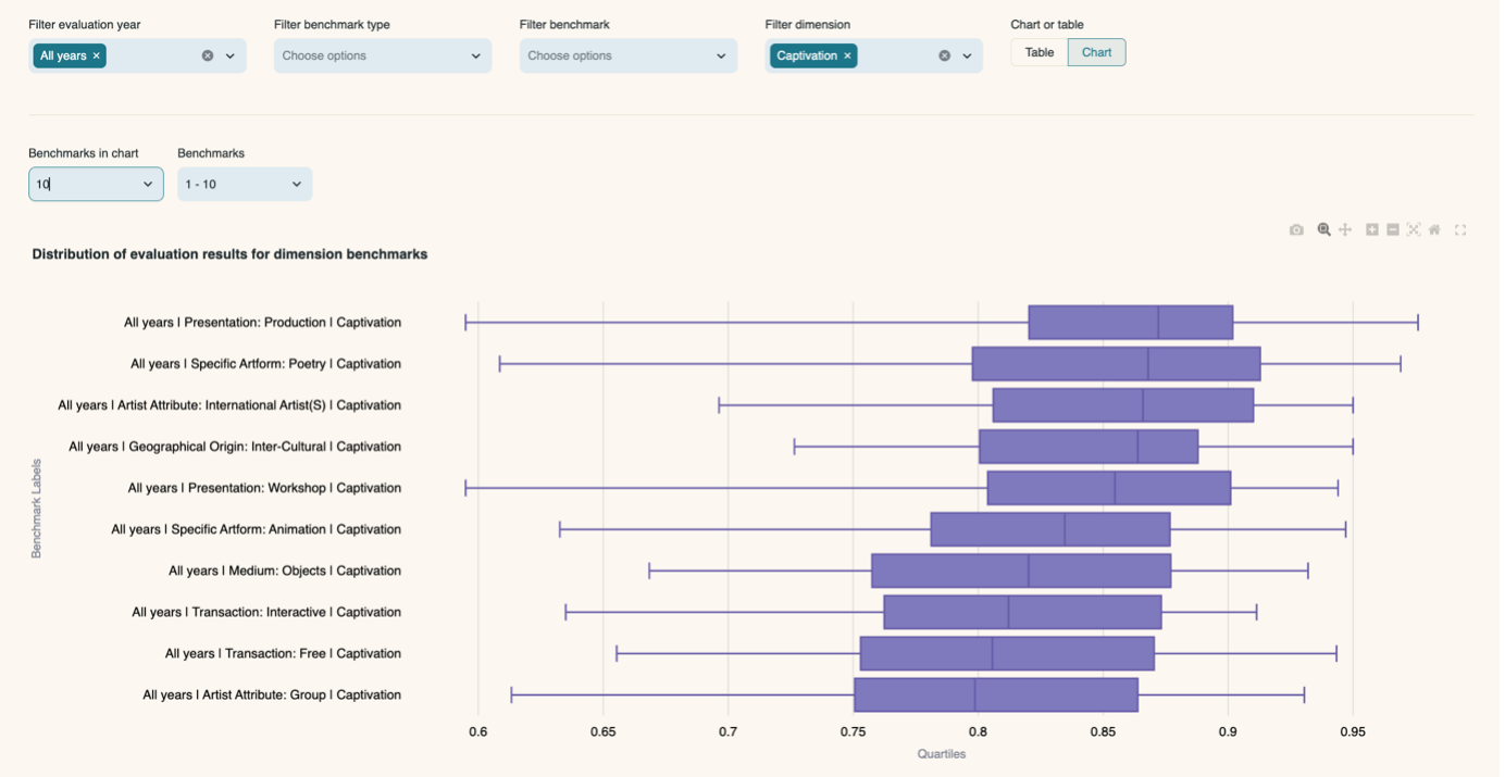
If you are viewing the benchmarks as a chart, you can choose how many benchmarks to include in the chart (10, 25 or 50). If there are more than can fit in the chart, switch pages using the controls above the chart.
The example chart below shows 10 available benchmarks that align with the following filters:
Evaluation Year – All years
Dimension – Captivation
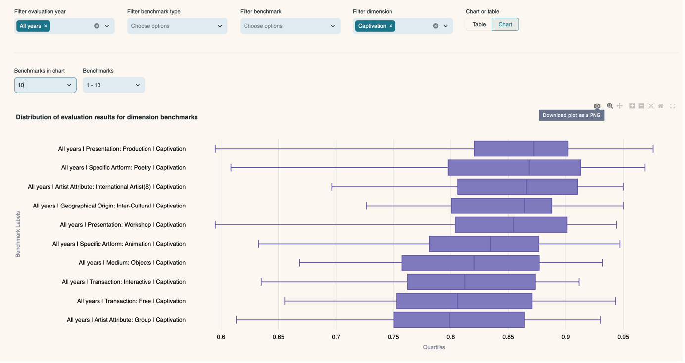
To download the chart as a .png, click the ‘Download plot as a png’ button in the top right-hand side of the chart which appears when you hover over it.
Click here to download a CSV of the benchmarks from the Impact & Insight Toolkit.
4.7 Illuminate Export
If you have used an Illuminate-Compliant evaluation template in the Culture Counts platform, you can extract the Illuminate data from this page. The data will be exported as a CSV file which has been formatted so that it can be uploaded into Illuminate without any manipulation.
To use the converter:
- Select an evaluation from the list.
- Choose an Illuminate template version (2023-24, 2024-25 or 2025-26 at time of writing).
- Click the ‘Convert’ button.
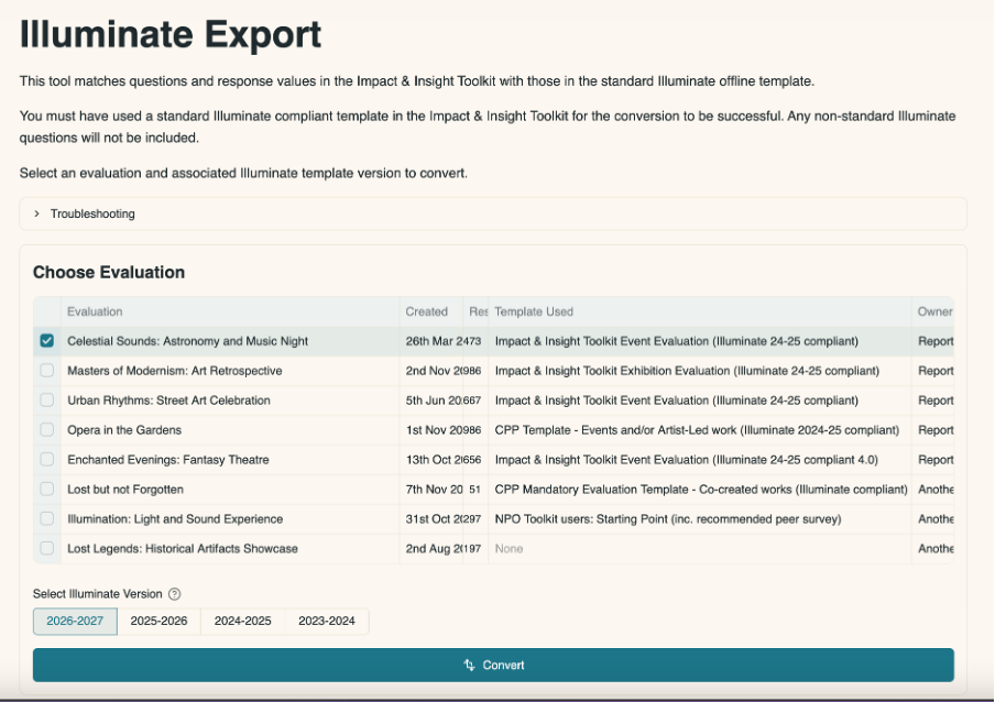
After clicking ‘Convert’, it will take a few seconds for the conversion to take place.
The page will then show you:
- Which evaluation template the evaluation was created from
- How many public responses were collected
Beneath that there will be links to download two files.
One is a CSV which is ready to be uploaded – the Quick Upload CSV. If there were any invalid responses in the original dataset which would not upload into Illuminate, they will be removed from this file. In the example below you can see that there were originally 473 responses, but only 382 rows were valid for upload to Illuminate.
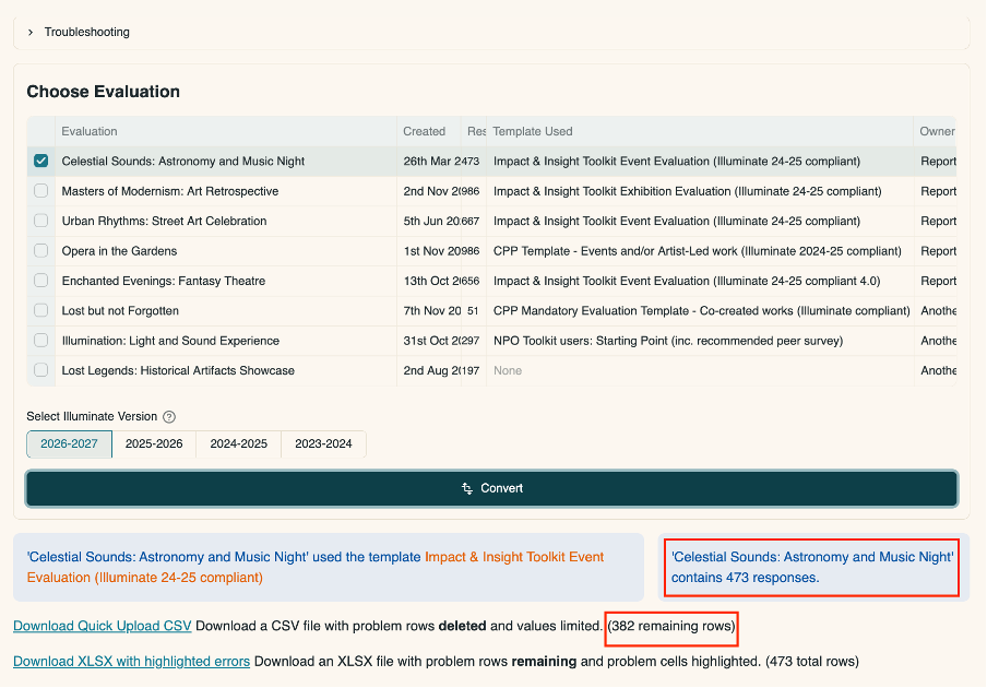
You can also download an Excel spreadsheet which has all the rows present and highlights the values in the data which would cause a problem when trying to upload into Illuminate. Click on ‘Download XLSX with highlighted errors’ to access this information.
The Troubleshooting dropdown menu contains further information to help you with uploading data into Illuminate.
For information on uploading the converted data to Illuminate, please see the relevant guidance on our website.
4.8 Thematic Analysis
This feature analyses data from freetext questions using a large language model (a type of artificial intelligence [AI]). It searches for common themes within comments or feedback and presents its findings as themes. Each of these themes is also tagged with key concepts.
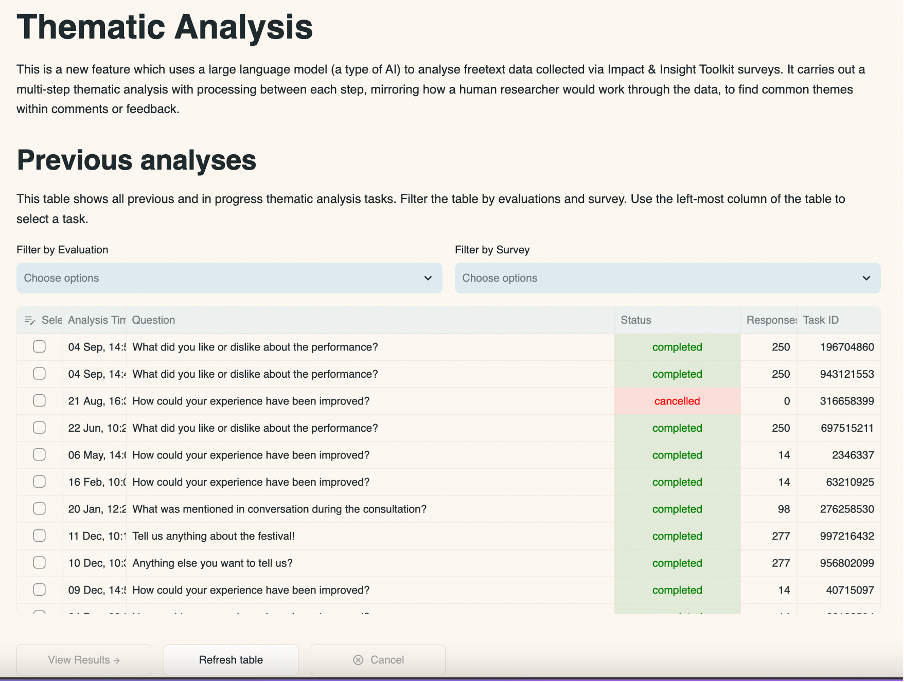
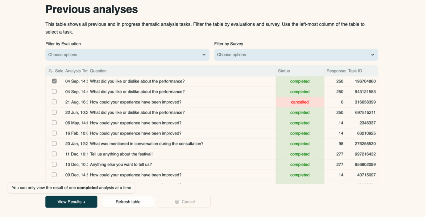
4.8.1 Previous Analyses
This shows any completed or in-progress thematic analysis tasks. The tool will analyse one question at a time. The status bar shows whether a task is completed or in progress.
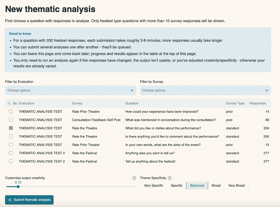
4.8.2 New Thematic Analysis
Under ‘New thematic analysis’, choose a question from the list by clicking in the select box in the left-most column. The list will only contain freetext questions with responses from your surveys. A question needs to have 10 or more responses in order to be analysed.
You can filter by evaluation and by survey.
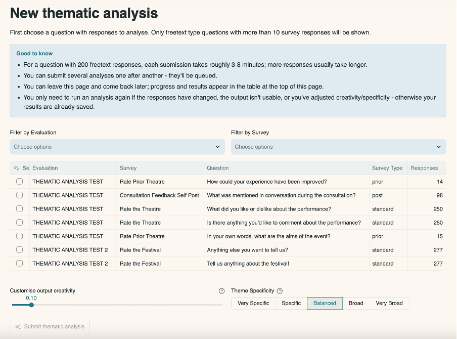
Mostly, the ‘Custom output creativity’ and ‘Theme specificity’ settings should be left as the default. However, you can change these if you choose. See further information below.

Custom output creativity: The closer to 0 this is set, the more precise and predictable the responses will be. If set closer to 1, it will allow for more creative and varied output, but may increase the chance of generating inaccurate or imagined content.
You should only adjust this if:
- the topics (groups of themes) or themes from an analysis feel too rigid or repetitive and you want to find unexpected patterns
- the descriptions/summaries feel too dry and you’d like richer, more nuanced phrasing.
Conversely, if the output drifts from the actual responses or introduces ideas that aren’t supported, lowering it keeps the results tighter and more faithful to the response data.
Theme specificity: Broader options will generate fewer themes with more topics and more specific options will produce more themes with fewer topics.
You should only adjust this if the themes from an analysis feel too fragmented or too general for your purpose.
For example, choose a more specific setting to drill into fine-grained distinctions when you need detailed insights, or a broader setting to consolidate related ideas when you prefer higher-level, summary themes.
Click ‘Submit thematic analysis’ at the bottom of the page when you are ready to start the analysis.
The task will then appear in the ‘Previous analyses’ table above once you click the ‘Refresh table’ button. Whilst it is in progress, you can visit other pages in the dashboard, and it will continue in progress in the background. If you submit multiple analyses then they will be queued.
To view the results for a question, in the ‘Previous analyses’ table, click in the select box in the left-most column and then click ‘View Results’ (you can only view results for one question at a time).
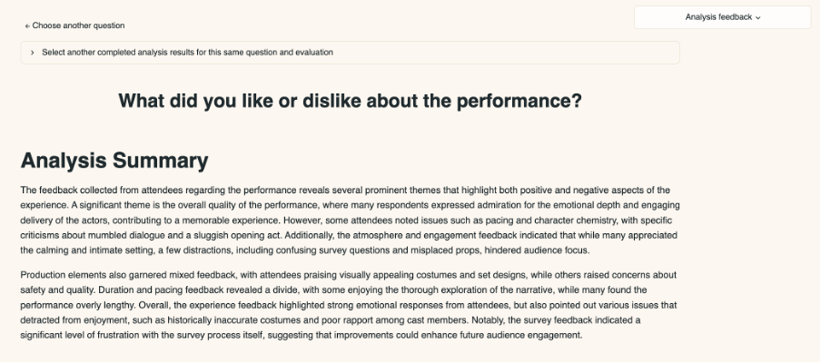
4.8.3 Thematic Analysis Results
The Analysis Summary gives an overview of the findings.
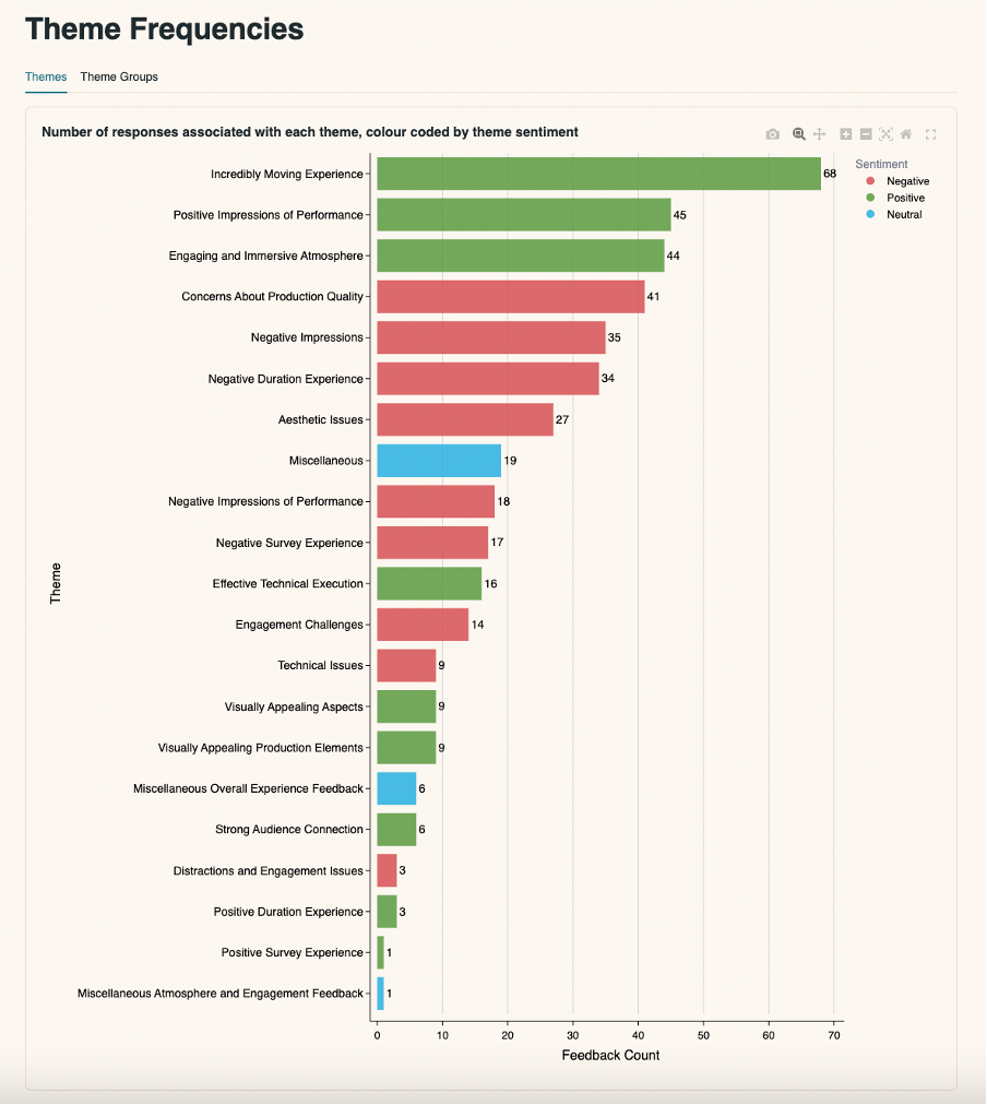
Theme Frequencies
The ‘Theme’ chart shows how many responses fall under each theme, colour-coded by theme sentiment, i.e. negative, positive, neutral.
You can download the chart by selecting the camera icon labelled ‘Download plot as png’, visible in the top left corner when hovering over the chart.
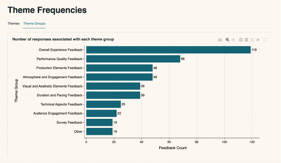
You can also view a chart that shows the ‘Theme Groups’ and the number of responses associated with each group. You can download the chart by selecting the camera icon labelled ‘Download plot as png’, visible in the top left corner when hovering over the chart.
Discovered Themes
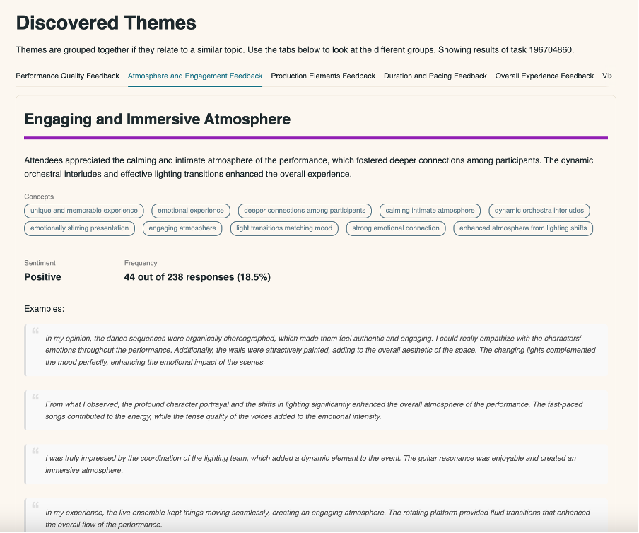
Identified themes are grouped together into topics (e.g., overall experience or performance quality) if any have been identified. Each theme will contain concepts which are the specifics of that theme.
A colour is attributed to each theme so that they are easily identifiable when matched to the individual responses, which can be viewed further down the page in the Feedback Filter & Search section.
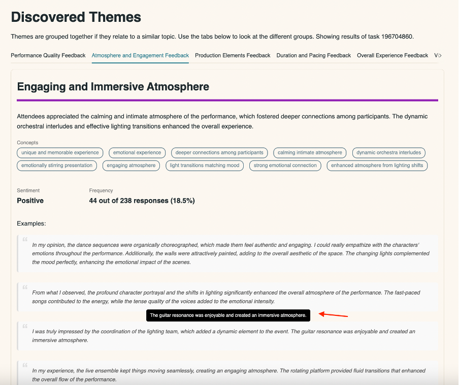
Hover over examples in a theme to highlight the bit of text that is relevant to that theme, as a response may be in more than one theme.
Click ‘Download Theme Info’ for this information as a CSV.
Feedback Filter & Search
This section allows you to review the raw feedback in full and filter by the identified themes and/or overall sentiment.
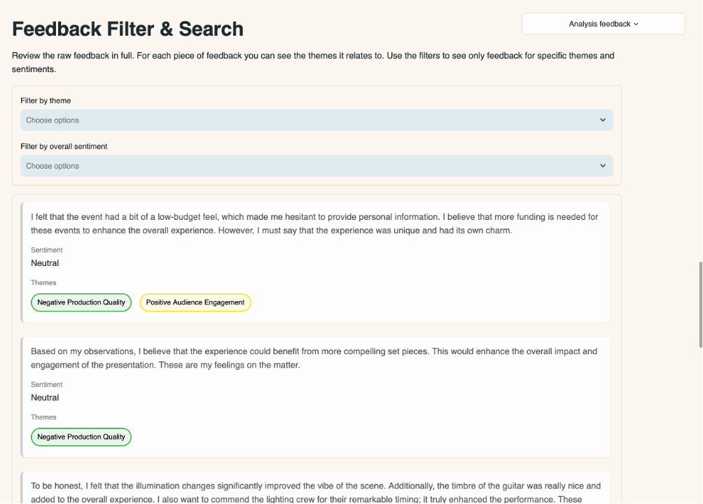
Selecting ‘Download All Feedback’ at the bottom of the section enables you to download all included feedback, tagged with themes, as a CSV.

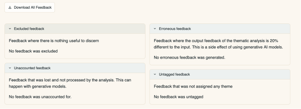
Click through the dropdown tabs at the bottom of the page to view:
- Excluded feedback, where there is nothing of note to discern
- Erroneous feedback, where the output feedback (the thematic analysis) is significantly (20%) different to the input (collected responses). This is a consequence of using generative AI models
- Unaccounted feedback that was lost and not processed by the analysis. This also sometimes happens when using generative AI models
- Untagged feedback that was not assigned any particular theme.
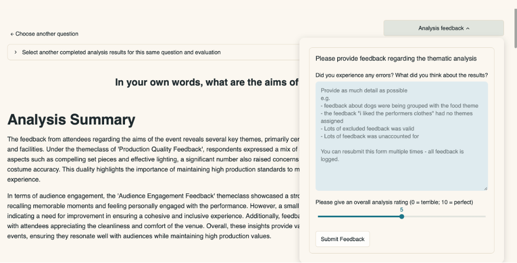
You can provide feedback on the analysis itself by clicking on the Analysis Feedback button and typing in the box:
If you’d like to know more about Counting What Counts’ general position regarding the use of AI in their processes, please look at the AI at Counting What Counts Q&A, linked here.
4.9 Data Import Clean & Check
If you have filled in a data template with responses that you wish to upload to a survey in Culture Counts, then you can run it through this tool to check for any issues that may prevent it from uploading successfully. It must be a CSV file in the format of a data template downloaded from the Culture Counts dashboard on the survey Summary page.
To use the tool:
- Click on the ‘Upload’ button to upload the CSV file
- Click ‘Submit CSV for checking’
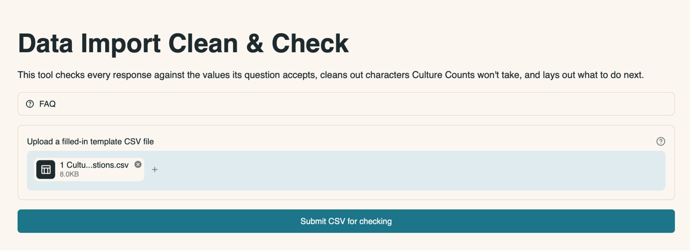
It will take a few seconds for the check to take place.
The page will then show you:
- The total number of responses
- How many are ready to upload
- How many need review
- How many automatic corrections were made
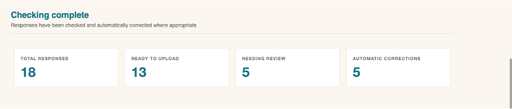
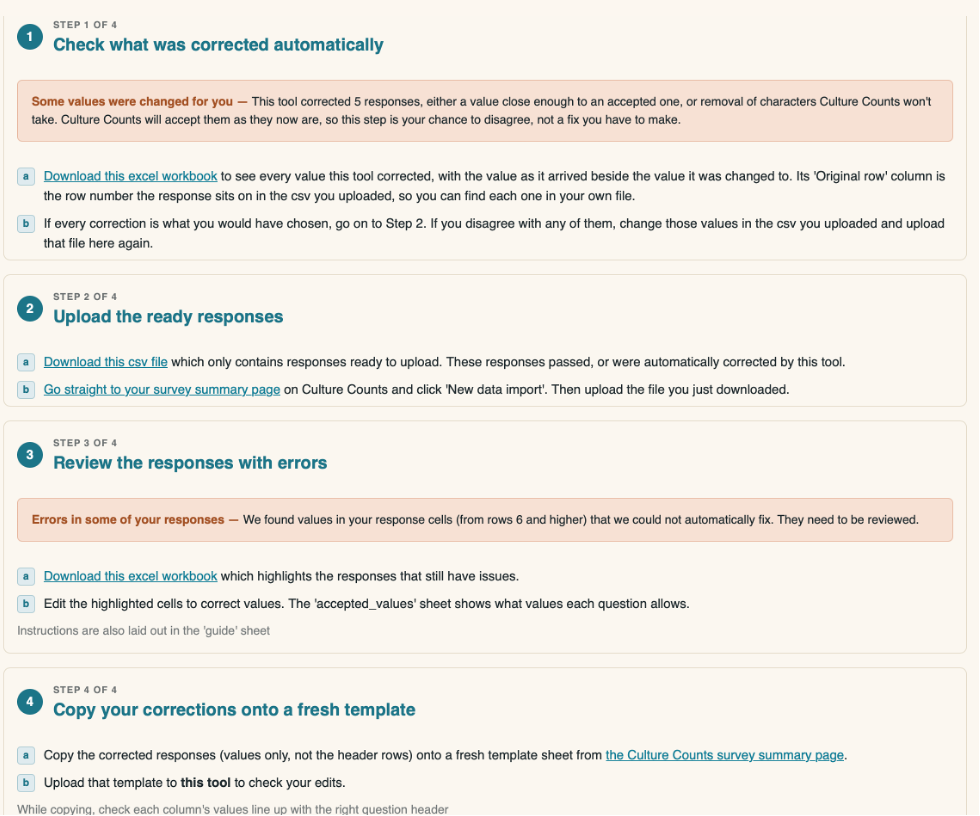
Beneath this will be step-by-step instructions guiding you through how to check and upload your data. You will be able to review any automatic corrections to check you are happy with them and review and edit any errors found. There will be CSV files with the relevant responses and information for you to download. The number of steps will depend on any errors found.
The FAQs dropdown menu at the top of the page contains extra information for common issues that can occur.
5. Tips
5.1 Navigation
If you select an evaluation or multiple evaluations, this selection will carry onto the next page you click for your convenience. The exception is the Evaluation Results page, which only displays one selected evaluation at a time.
5.2 Page Sizes
To make the look of various pages consistent across devices, there is a minimum page width that should fit each page on a 13-inch display fully. If your page is not showing in full, use your browser’s view settings to zoom in or out to display the page correctly. (Shortcut: hold the keys CTRL (command on mac) and + to zoom in or CTRL and – to zoom out).
6. Troubleshooting
6.1 Dashboard Updates
Please note that the dashboard updates overnight. You will be unable to log in during this time, and will need to wait until the following day for any changes you have made to become visible within the dashboard.
Arithmetic Mean: Definition How to Find it
Margin of Error: Definition, Calculate in Easy Steps
Percentiles, Percentile Rank & Percentile Range: Definition & Examples
Interquartile Range (IQR): What it is and How to Find it
Statistical Significance: Definition, Examples
Box Plot (Box and Whiskers): How to Read One & Make One in Excel, TI-83, SPSS