1. Introduction
The Insights Dashboard was delivered as part of the Impact & Insight Toolkit (Toolkit) version 1 (2019-23) project. The dashboard allows for the discovery of emerging trends in the experiential data of audiences across different English regions, or the types of cultural or artistic content being evaluated by the Toolkit.
The Insights Dashboard provides transparent access to the data gathered by the Toolkit project and offers valuable insight into how audiences and peers feel about the arts and cultural works they have experienced in England. It should prompt discussion around other potential avenues of data research which can provide additional insights for organisations and the sector.
There is not an overarching narrative or lesson which is intended to be told with the dashboard. Users are encouraged to explore the data themselves; to ask their own questions and find their own answers. So long as the dashboard is used and interpreted following the guidelines explained in this document, any patterns found by the user are valid and worth consideration and discussion.
If you have any suggestions for improvements to the dashboard; research questions which it could be applied to; or want help interpreting the content, please don’t hesitate to get in touch.
2. Navigating the Dashboard
The dashboard consists of five sections. Each section addresses different questions a user might have of the data.
The panel on the left-hand side is the navigation bar and is present on every page of the dashboard; it highlights which page you are on. To move between sections, simply click on the name of each section in the left-hand navigation bar. It will highlight which page, or section, you are in at any given time.
3. Guidelines for Interpreting the Dashboard
Limitations of averages
Mean averages are used often in the dashboard. An average condenses a lot of information into a single number. This is good because it allows us to quickly understand or see similarities and differences between large groups of data. However, the limitation is that it doesn’t show the variety within the group or exceptions to the norm of the group.
For example, if we group evaluated works together by their artform, the mean average of that group will tell us trends for that artform, but it doesn’t tell us very much about the individual datapoints (evaluated works) that make up the group.
It’s important to remember this limitation when interpreting. Just because the average for one group is higher than another group, it does not mean that all evaluated works in that group will, or should, have higher/lower results.
Making inferences
When we talk about inference, we mean being able to learn something about a larger group based on what we know from a smaller group. For example, if we measure the heights of 25 random basketball players and find they are all significantly taller than average, we can infer that all basketball players are generally taller than average.
In the case of the Toolkit, one example might be learning the shared qualities of all artistic or cultural works in a specific region based on the sample of works which have been evaluated in that region.
On any page of the dashboard where we use averages, we also provide a table which tells you how many evaluations were used to calculate that average and how many different NPOs provided them. For example:
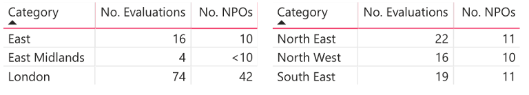
When using the dashboard to make inferences about a given region or type of work, it is crucial to take into account the number of evaluations which we are basing those inferences on. If, like for the East Midlands in the example above, there is only a small number of evaluations then you cannot assume that the averages shown are representative of all works in that region.
There is no universal number of evaluations which will ensure sufficient confidence, whatever the comparisons being made. However, as a rough guide, we advise only considering an average to be representative when there are at least 15 evaluations included.
Using the findings
Should you wish to use findings from the dashboard in reports, research, talks or other content, please ensure that you provide some appropriate context for those you are reporting to.
An example of the appropriate context:
- What the finding is – e.g. Visual arts organisations tend to have high expectations
- Give some numbers so people can appreciate the size of the finding – e.g. the average self prior survey result is between 1% and 7% higher than other artforms for 8 of the 9 metrics used
- The sample sizes – e.g. 49 evaluations from 15 visual arts organisations
- The source of the finding – the Impact & Insight Toolkit
4. Statistics in the dashboard
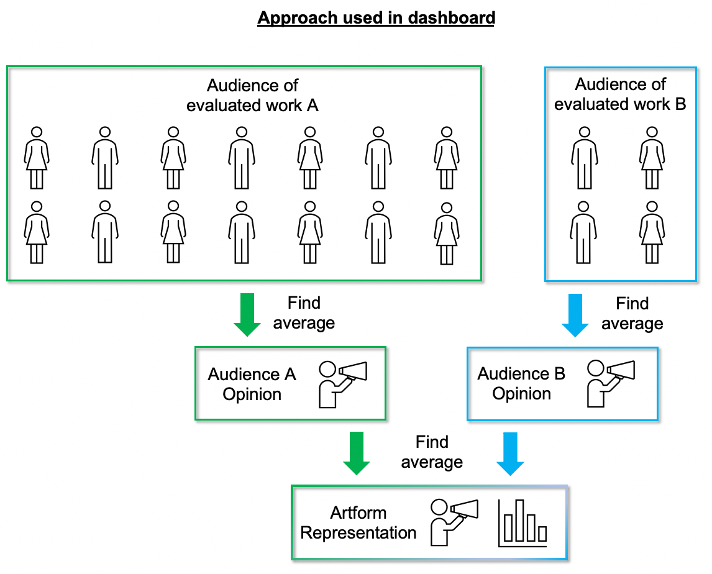
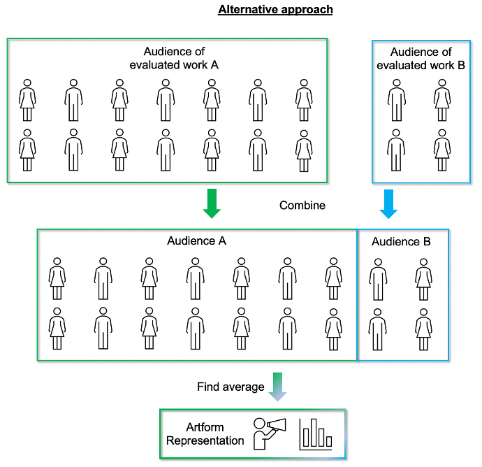
Calculating the average
The data driving this dashboard comes from individual evaluations, for individual pieces of work – whether a play in a theatre, an online experience, a live music show or poetry reading.
Each evaluation is equally as important and should contribute equally to any statistics we calculate, regardless of the number of people who experience the work being evaluated.
For that reason, averages shown in the dashboard for a group of evaluations are ‘averages of averages’. This means we find out the audience opinion of each individual evaluated work first, before grouping these to find out the general representation for an artform.
The alternative would be to combine all the audiences from works within the category and calculate the average once. However, this alternative approach would mean that works with larger audiences would have more representation than those with smaller audiences.
The diagrams below demonstrate the difference between the two approaches:
Sample Sizes
When calculating averages for public audiences, we exclude evaluations which have fewer than 25 samples. The reason for doing this is because small samples have a high chance of being unrepresentative. For example, by coincidence you might only survey people who had a negative opinion, resulting in a value which is unfair or unrepresentative of what the audience as a whole thought. However, this becomes increasingly unlikely if more people are surveyed. By removing those evaluations with small sample sizes, we reduce the effects of random chance on the insights we find.
We understand that certain types of work will have smaller audiences by their nature and as a result this might affect some users more than others – you can’t collect 25 samples if you only have an audience of 10 people! In the future, we would like to address this by only excluding evaluations which have a small sample size relative to their audience size. As a user of the Toolkit you can help us resolve this sooner by tagging your evaluations with the size of the audience in the Properties section of your dashboard, before you submit them.
For peer and self assessor averages we don’t make any restrictions on sample size as it is typical to have 1 or 2 responses from those types of respondent.
Quality Assurance (QA)
Before any data is fed into the dashboard, a quality assurance process is carried out on the dataset. This QA process primarily focusses on removing invalid survey responses or survey metadata. For example, some people might intentionally give wrong answers (e.g. an age of 500) which can skew statistics calculated using the data. Or we might see technical errors in the way data is collected or stored, for example, storing data as words when we expect numbers, breaking any calculations on the data.
In addition to checking the validity of the responses, it also anonymises the postcodes of respondents, ensuring that only the first part of the postcode is included in the dataset.
5. Updates and changing patterns
The dashboard will be updated with new data on a weekly basis. Because of this, patterns may change slightly over time. Patterns may change more for categories with small amounts of data than for those which have larger amounts of data.
We expect that patterns will eventually stop changing as we converge on data which is fully representative.
If you have any questions or would like help understanding something you find in the dashboard, please get in touch.